2023

Medication Management System

Company

*Anonymised*

My Role

UX/UI Design Lead

Constraints

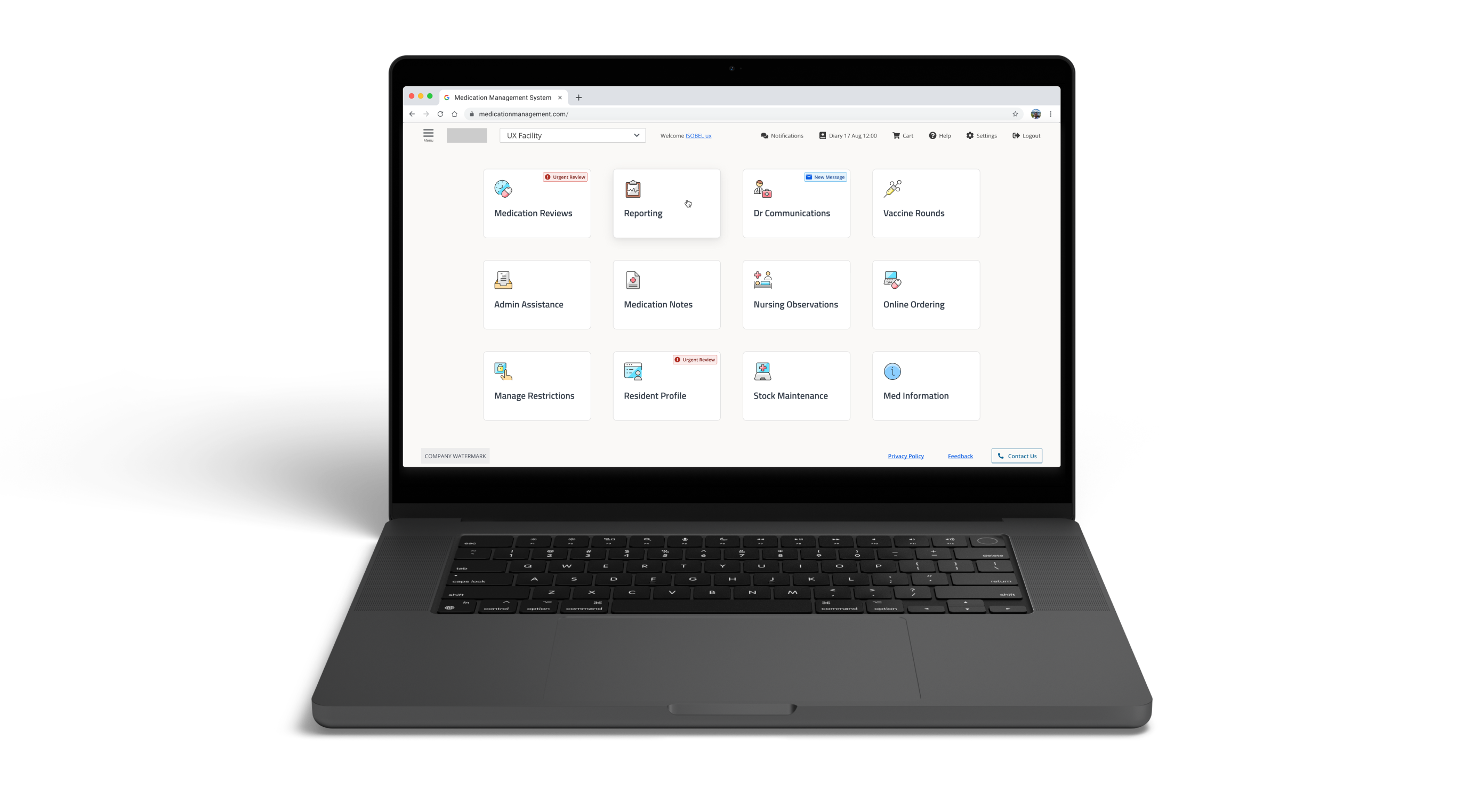
Client wanted to update the design language without drastically changing the current function and experience using the application.

Overview

This was a 6 months contract with a Sydney-based Medication Management System. Case study and screens are changed to preserve client confidentiality.

The Problem

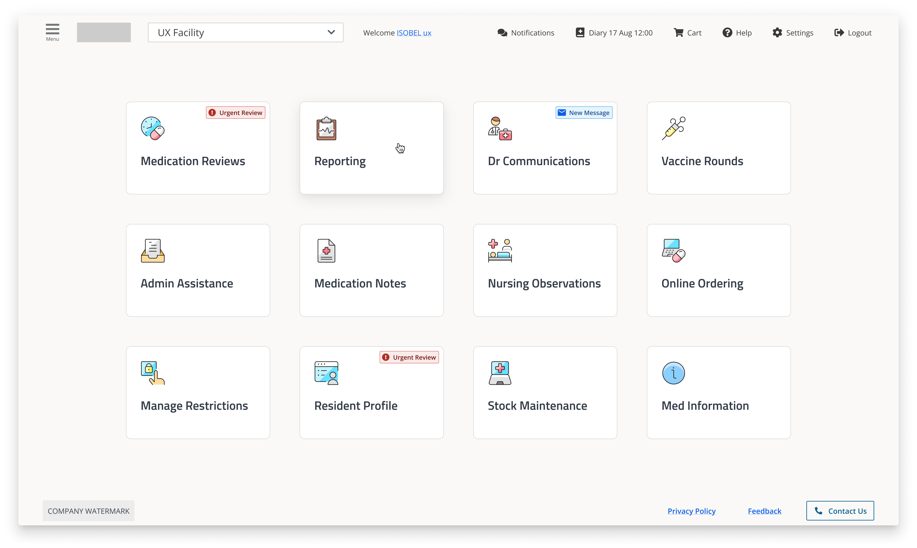
The interface was outdated, inaccessible, and difficult to use - especially in high-pressure, clinical environments. The goal: modernise the UI without overhauling the layout, improve usability across experience levels, and ensure compliance with accessibility standards.

Process

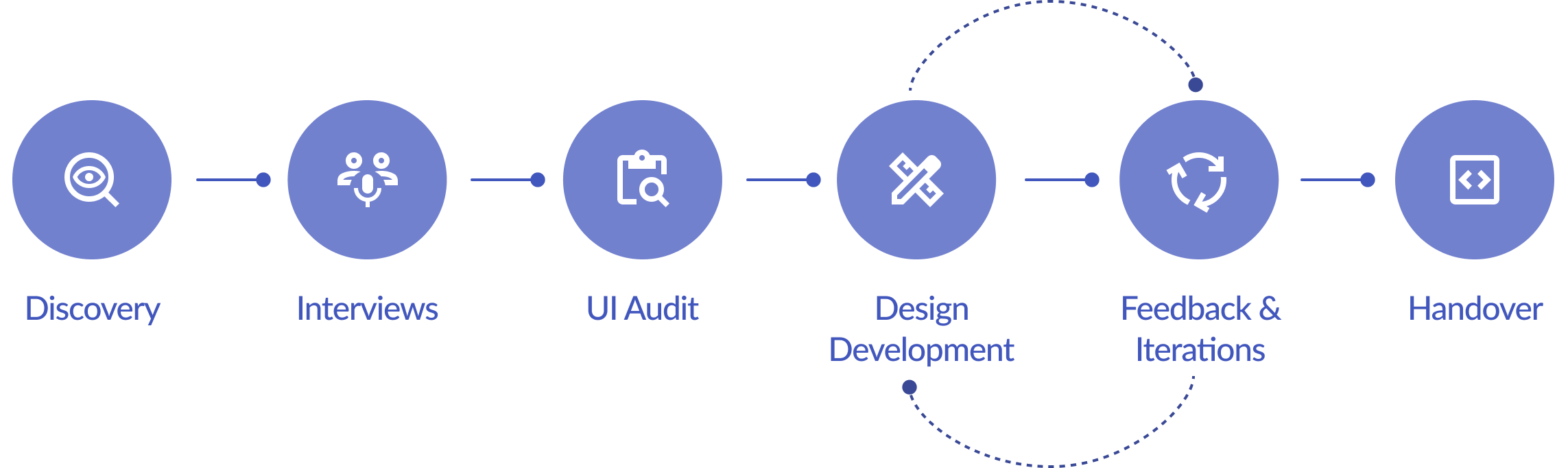
We interviewed existing customers and internal stakeholders to gather valuable insights, conducting a total of 30 interviews. Along with the initial discovery and UI Audit, this enabled us to generate key insights.

Stakeholder Interview

Key Insights
  • Visual language reinforces bias and confusion
    • Gendered and unclear iconography creates cognitive friction and alienates users, reducing trust and company perception.
  • Poor contrast is slowing users down
    • Low-contrast UI elements made essential actions harder to find, increasing user frustration and error rates.
  • Support pathways are hidden, increasing workload
    • Users couldn’t find the ‘Contact Us’ button, leading to an overflow of minor queries to the CS team.
  • Ineffective colour strategy blocks user focus
    • Poor use of colour reduced task prioritisation, accessibility, and confidence - especially for colour blind users.
  • Mobile experience fails to support core workflows
    • Lack of mobile optimisation disrupts prescribers’ on-the-go tasks, leading to frustration and workaround behaviours.
  • Visual clutter is hiding vital information
    • Poor alignment and spacing reduced scannability, making it easy to miss critical patient data.
User Needs
  • Medication workflows must support speed and safety
    • Interfaces should streamline task execution without compromising accuracy, enabling users to administer medication confidently and efficiently.
  • Critical signals must cut through the noise
    • Alerts, errors, and urgent tasks need to be instantly recognisable to prevent delays, mistakes, or safety breaches in high-pressure environments.
  • Essential information must lead the interface
    • Key details and safety checks should be surfaced prominently, guiding users through compliant, error-free workflows
Challenges
  • Colour blind users couldn’t rely on colour-coded indicators alone.
  • Low contrast text and icons were hard to see in information dense pages.
  • Important blocks of text were poorly aligned, impacting readability and increasing error risk.

Design Recommendations

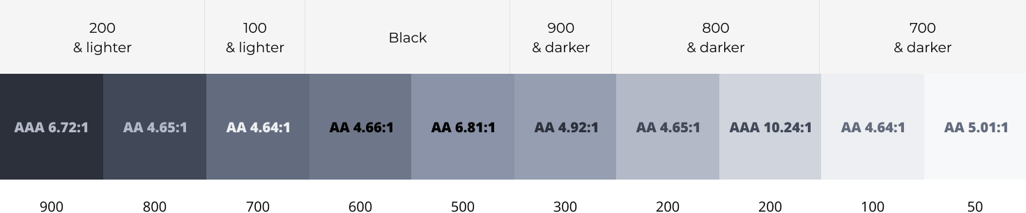
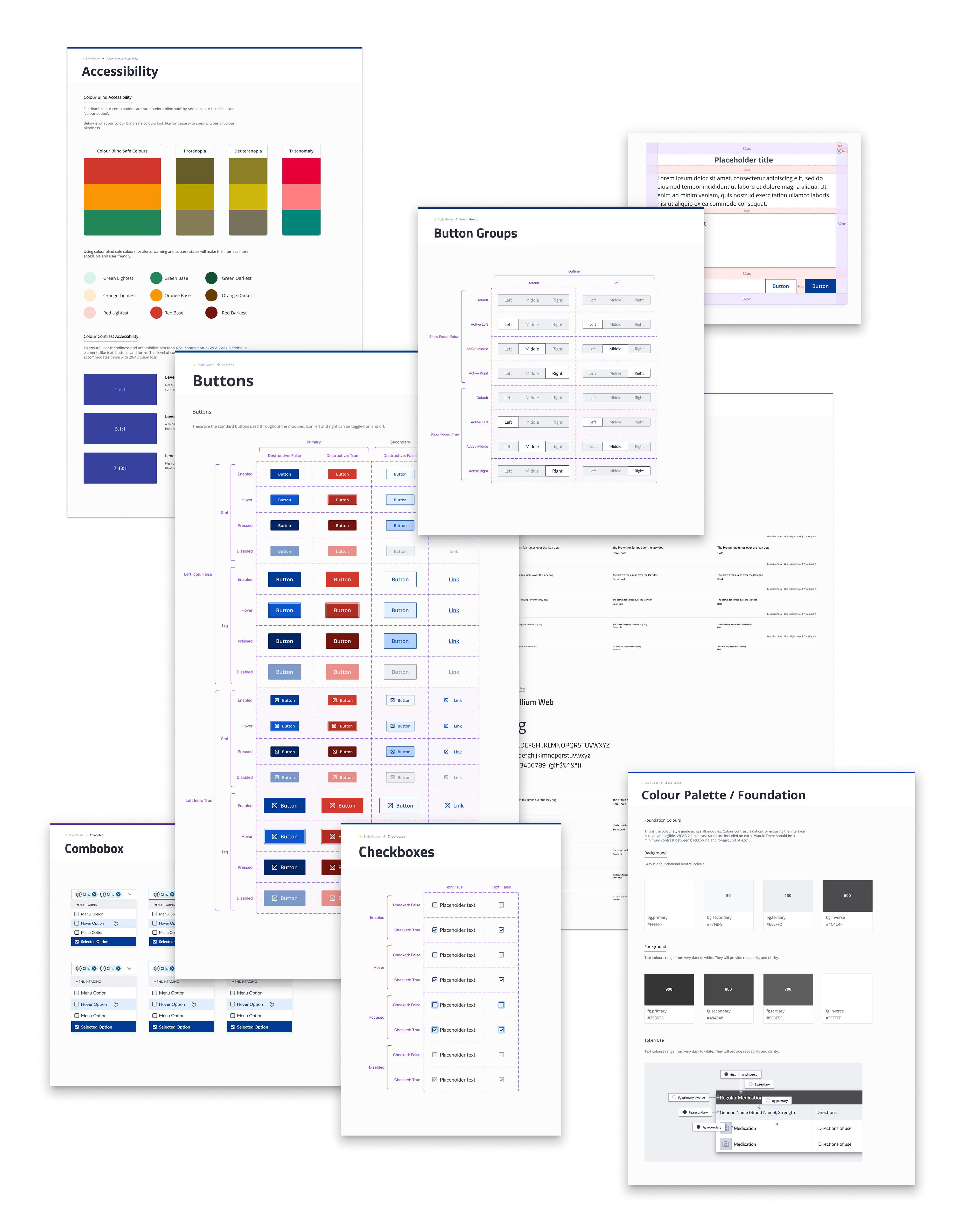
✅ Meet WCAG contrast standards

Table to assist team with WCAG compliant colours

✅ Use colour-blind-safe hues and additional cues (icons + text) for alerts
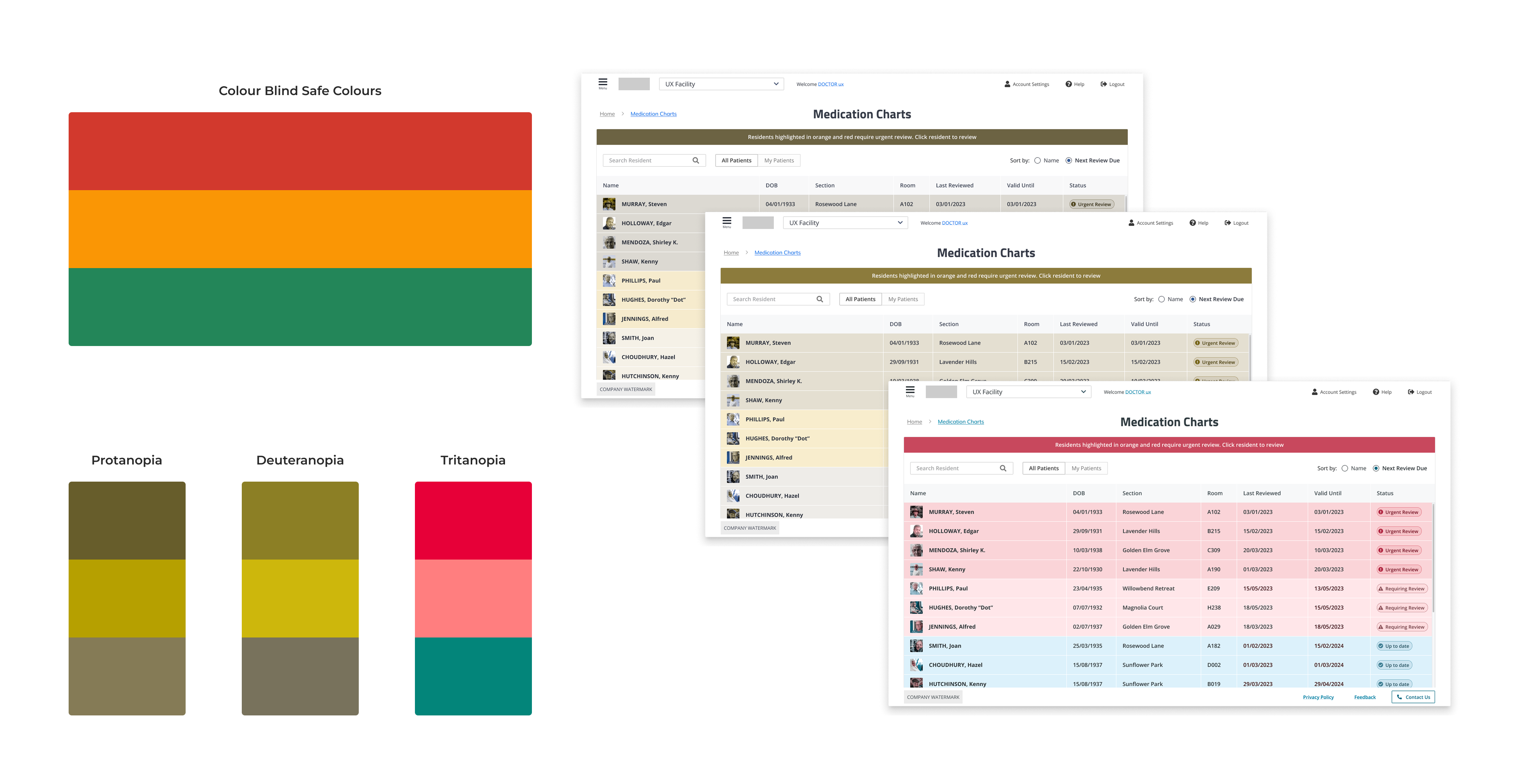
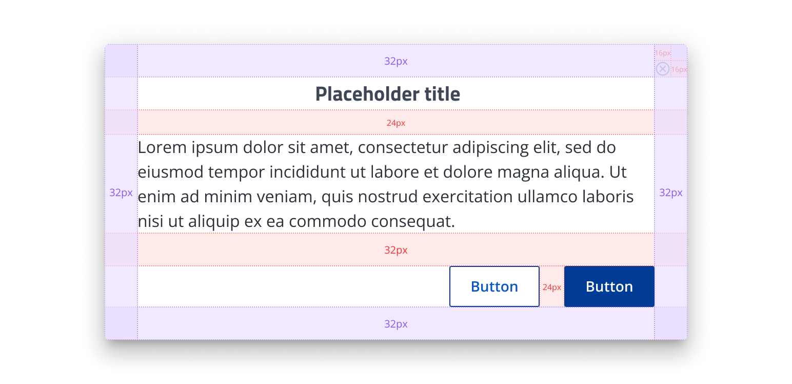
Colour blind safe colours

Improve visual hierarchy through consistent spacing (4pt system)

4pt Grid System

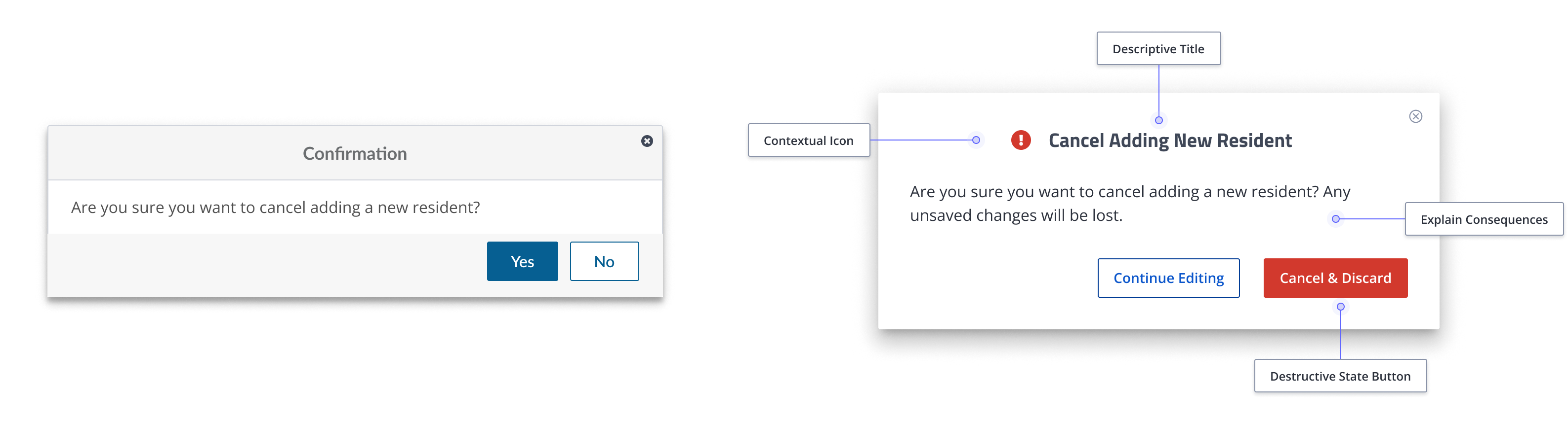
✅ Improve modal clarity and reduce user error by introducing a distinct destructive button state and more informative, action-oriented copy

Before and After modal adjustments

Usability Testing

New Users:

  • Found the updated homepage intuitive and easier to navigate
  • Adapted quickly due to lack of entrenched habits

Experienced Users:

  • More resistant to change, but provided deeper, critical feedback
  • Pointed out concerns around layout density and scrolling

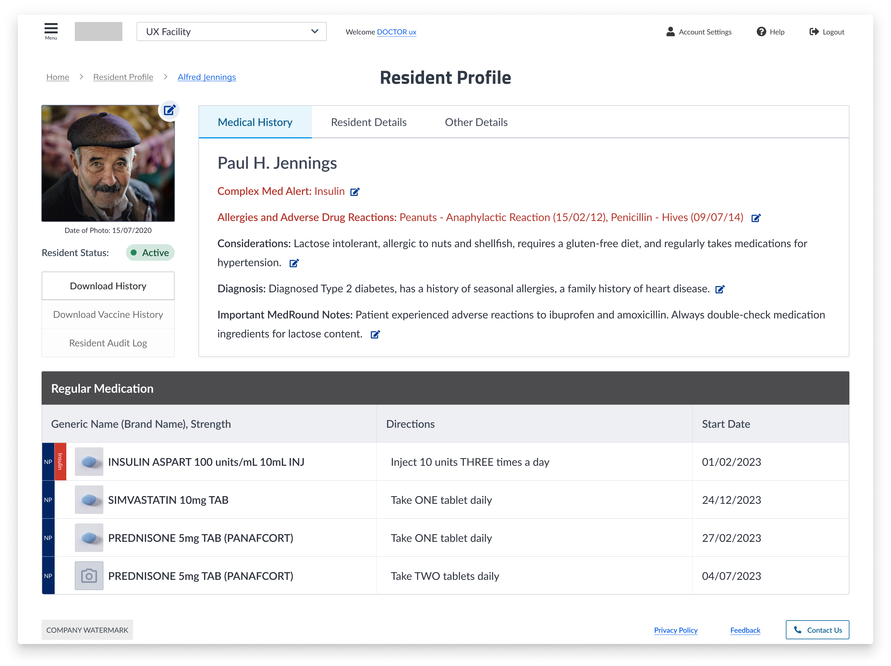
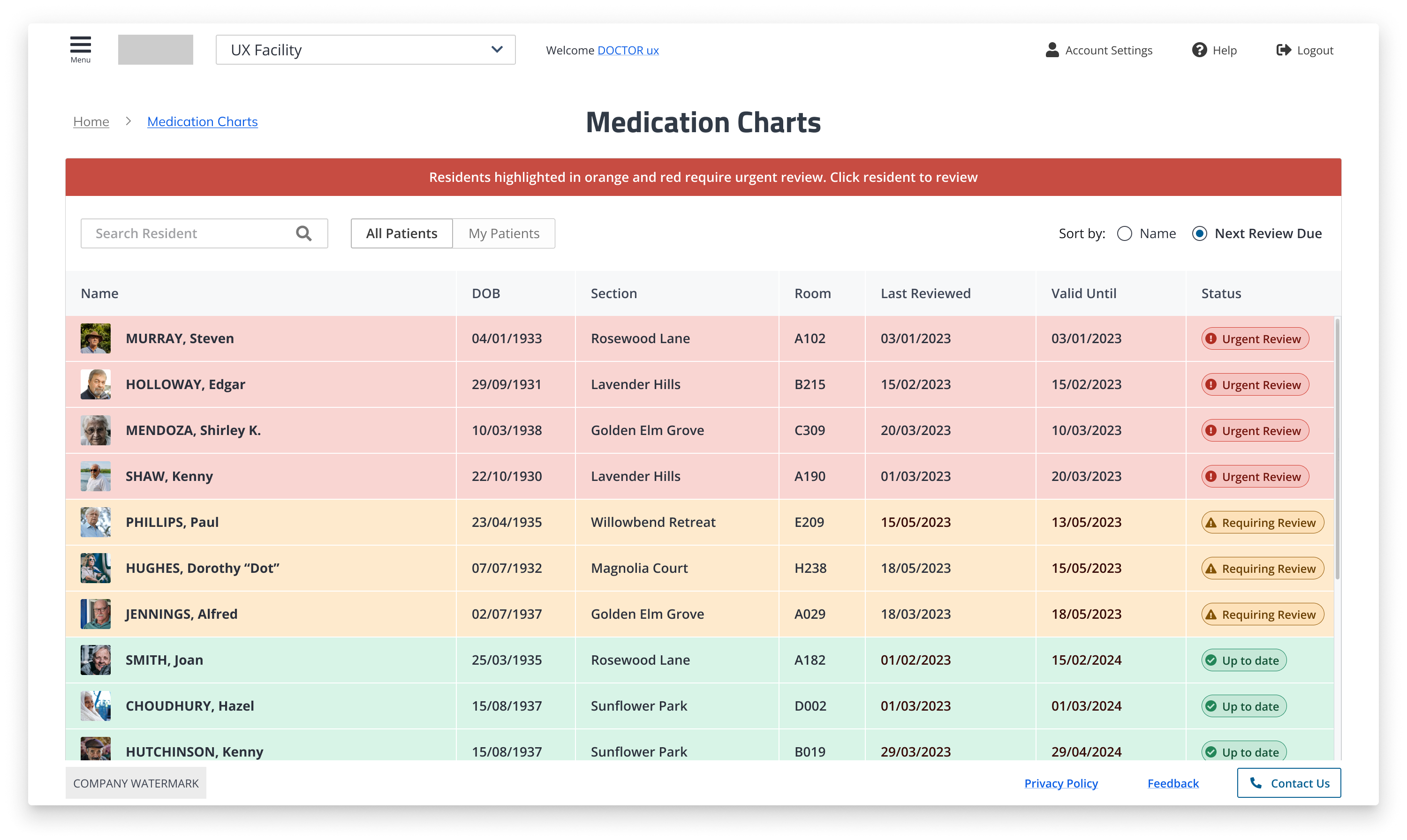
Patient Detail Pages:

  • Seen as much clearer and easier to read than current design
  • Some users found the amount of content overwhelming and “scroll-heavy”

Further Design Improvements
  • Adjust button styling for better visual clarity (e.g. less flat, stronger icon emphasis)
  • Decrease vertical spacing on detail pages to reduce scrolling
  • Increase cell height in large tables to improve visibility for visually impaired users
Check out Streamtime
No items found.
Outcomes
  • Higher confidence in workflows among new users
  • Improved accessibility across the board (WCAG AA compliant)
  • Reduced dependency on support for basic queries
  • Design system and spacing strategy now set up for scalable mobile optimisation

What I Learned
  • Accessibility isn’t just about colour - it’s about structure, spacing, and clarity.
  • Simplicity often outperforms complexity, especially in safety-critical systems.
  • Bringing user voices in early and often helped guide change-resistant teams to alignment.

OTHER PROJECTS

I’m Isobel, a designer based in Sydney, Australia.