*This case study has been anonymised for client confidentiality
2023
6-months
Design Lead
Avoid changing core workflow and IA
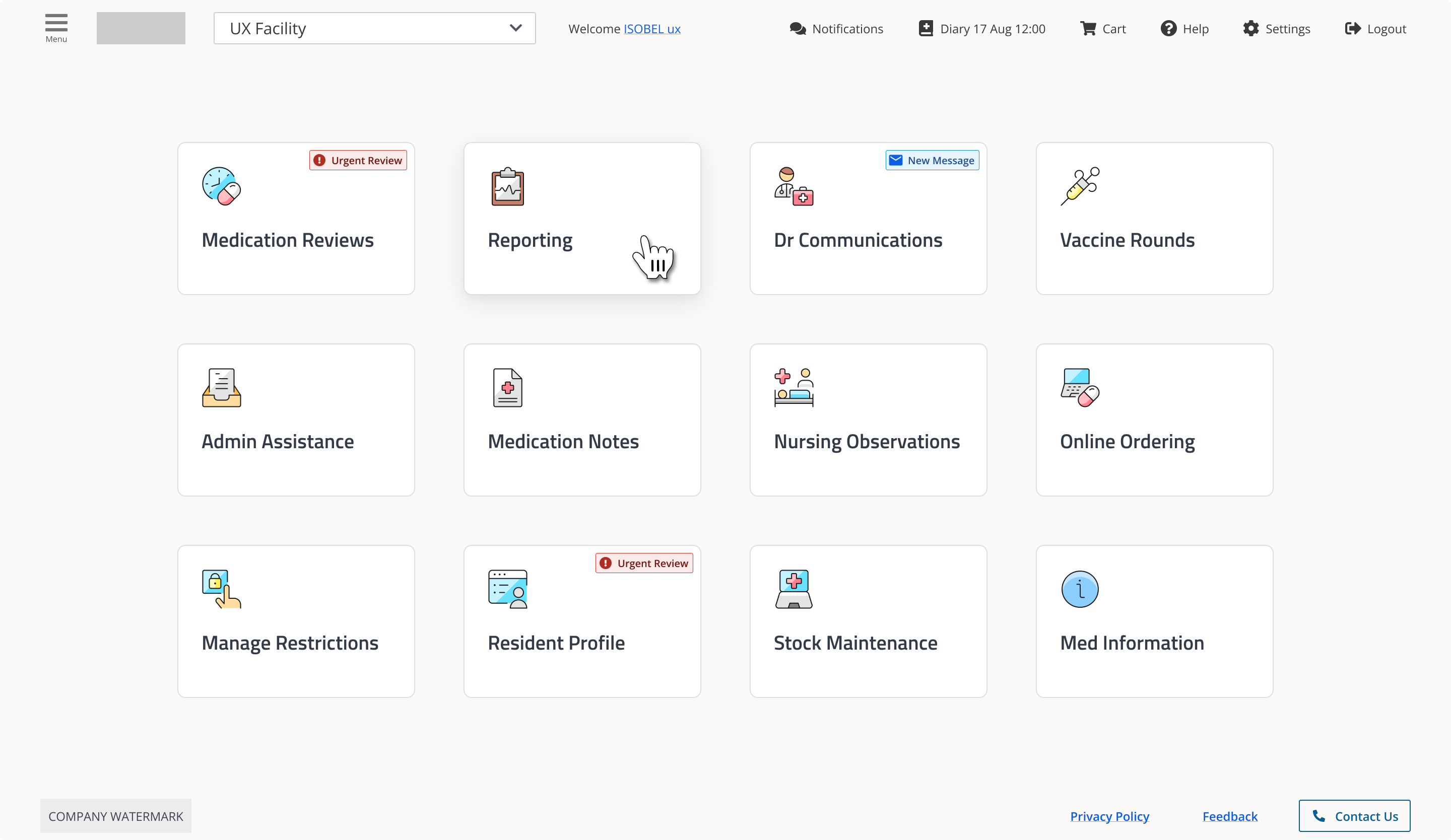
Nurses administering medication should not struggle to locate essential controls. However, users of a Sydney-based Medication Management System faced low contrast, unclear icons, and a help feature so difficult to access that staff resorted to calling Customer Support on their personal phones. However, disrupting established medication administration workflows poses significant patient safety risks. Therefore, the objective was not only to modernise the user interface, but to do so without altering elements critical to daily use.
I conducted 30 semi-structured interviews with nurses, prescribers, pharmacists, and support staff, along with a comprehensive UI audit assessing contrast ratios, colour-blind accessibility, icon consistency, and mobile responsiveness. My primary focus was to understand what was broken and why users had adapted to these issues.
Synthesis revealed three needs that became the decision-making criteria for everything that followed:
Speed and safety: Workflows must not delay nurses during dose rounds.
Signal clarity: Critical alerts must be immediately distinguishable from non-essential information.
Information hierarchy: Key details must appear at the right time, not be hidden in lengthy content.
Six critical issues surfaced consistently across roles:
Icons lacked clarity and consistency, so users relied on text and routine instead of visual cues. Some icons also had a strong gender bias.
Text size was inadequate for the clinical environment. In fast-paced wards with bright lighting and users who wear glasses, small text caused discomfort and posed a safety risk.
Support options were difficult to locate. The "Contact Us" feature was not accessible, so staff called support team members directly and submitted bug reports through unofficial channels.
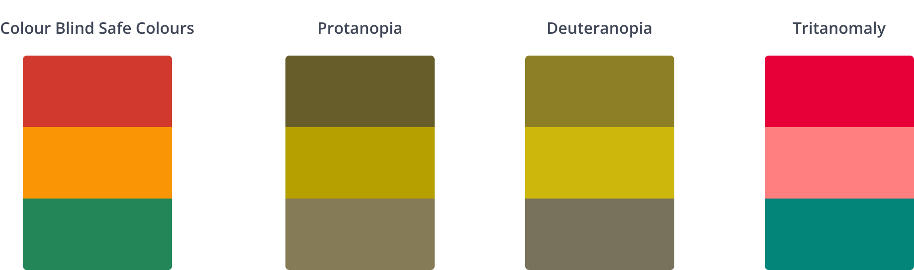
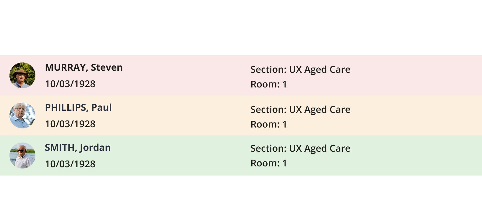
Colour-coded alerts were inaccessible to colour-blind users, making critical information unavailable to part of the clinical team.
The mobile experience was non-existent. Prescribers moving between patients lacked a reliable way to access the system on the move.
Inadequate spacing between text blocks hindered quick information retrieval during time-sensitive tasks and increased the risk of errors.
The UI issues were both visual and structural. Years of engineering-led decisions left the product without shared standards, UX documentation, or a single source of truth. Each on-screen inconsistency stemmed from this problem.
So before touching a single screen, I built the system that would make the redesign stick.
Audit and inventory
I reviewed existing product screens and flows, identifying inconsistencies, duplicates, and accessibility issues. This gave a clear overview of what to consolidate and remove.
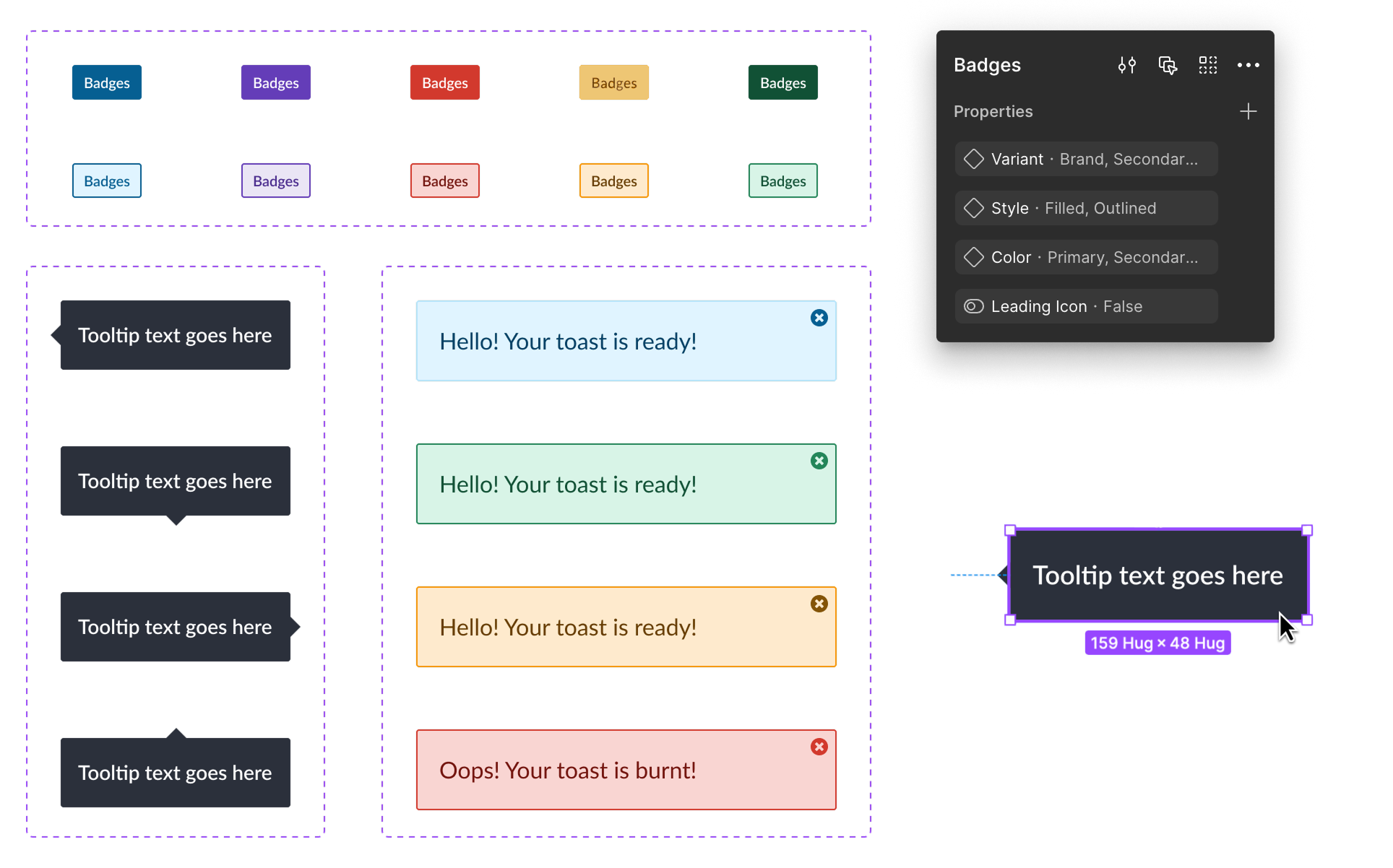
Design tokens
Developed a scalable type system, a 4-point spacing scale, and a WCAG AA-compliant colour palette. Established guidelines for grids, layout, icons, and interaction states.
Component library
Designed reusable, responsive UI components in Figma, including all interaction states: hover, focus, active, disabled, and destructive. Prioritised readability for clinical environments.
Documentation and handoff
Provided usage guidance, naming conventions, and component best practices directly in Figma. This enabled engineers and PMs to make informed decisions. This approach shifted work from starting each new screen from scratch to a more efficient, standardised process.
With the foundation established, the screen-level redesign operated within defined constraints and followed a clear rationale for each decision.
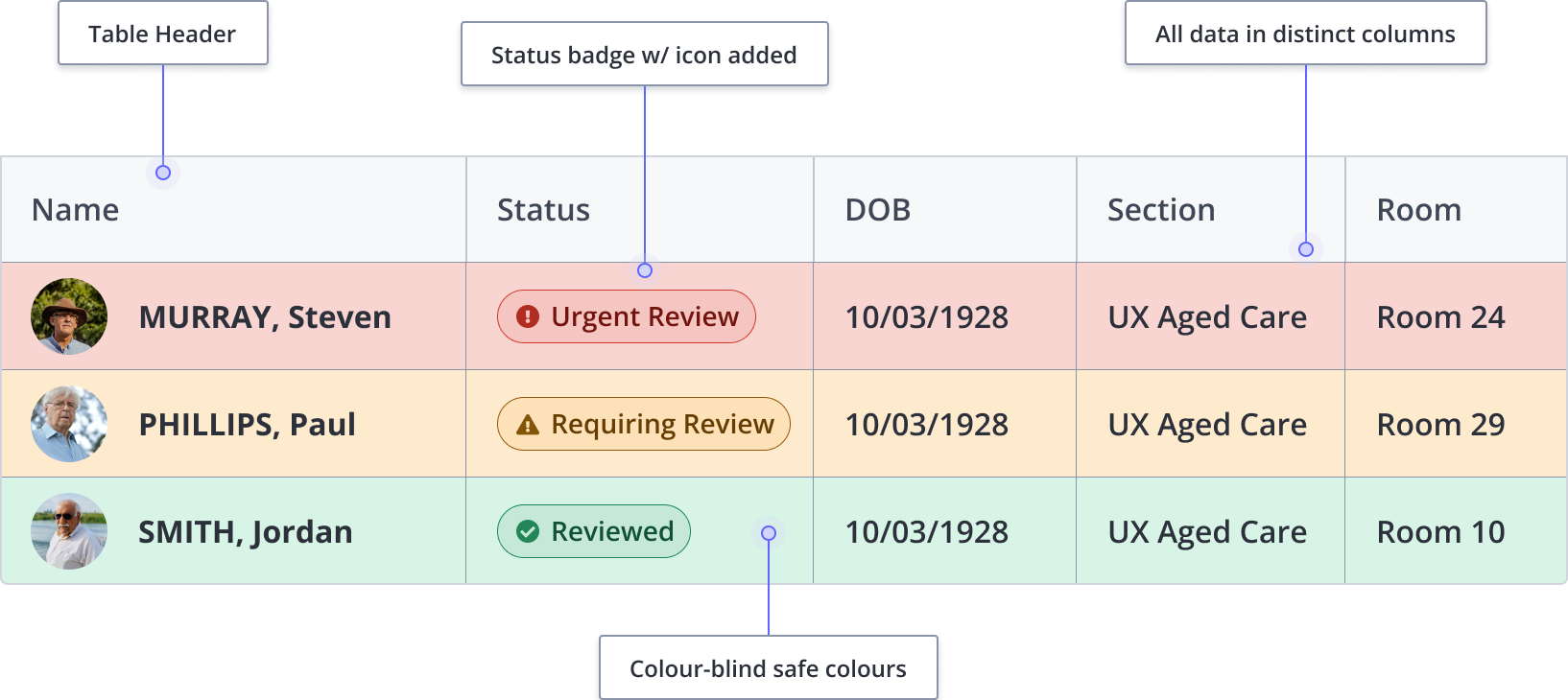
Designed for colour-blind accessibility by default.
Some colour-blind prescribers missed critical alerts. To fix this, each alert state now includes icons and text labels to support colour. The guiding principle is that if removing colour compromises meaning, the design is incomplete.
Layered communication for icons
As users stopped trusting icons alone, we combined colour, icon, and text labels. This ensured users kept familiar navigation paths.
Before
After
4-point spacing improves scannability
The spacing system improved scannability of patient information during time-sensitive tasks and set a foundation for future mobile optimisation.

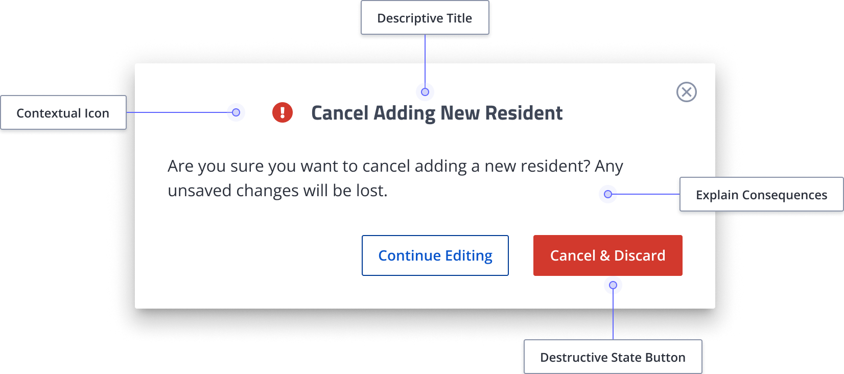
Microcopy improvements for error reduction.
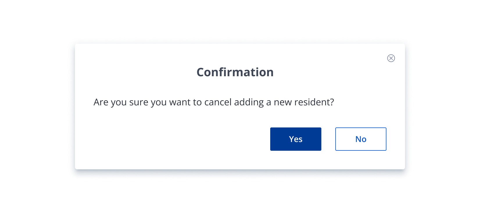
Unclear copy was a recurring pain point in research. For example, one doctor reported accidentally deleting work during a consultation because a confirmation modal displayed only "Yes" and "No" without clarifying what she was confirming. In the redesign, every label, button, and prompt was rewritten to specify the action, explain the consequence, and remove ambiguity.
Before
After
We tested the redesign with users of different experience levels to ensure it met a wide range of needs.
Impressions differ depending on experience level. Users with less than one year of experience found the new homepage clearer and more intuitive than those with more experience. Newer users may adapt more easily because they have not developed established habits. In contrast, experienced users are more familiar with the current interface and are more likely to notice issues or resist change.
Participants found the new dose round table easier to read and understand. Some raised concerns about the size difference, particularly for staff who wear glasses. Due to this, the cell size was increased. Overall, the updated design was well received, with many appreciating its clarity.
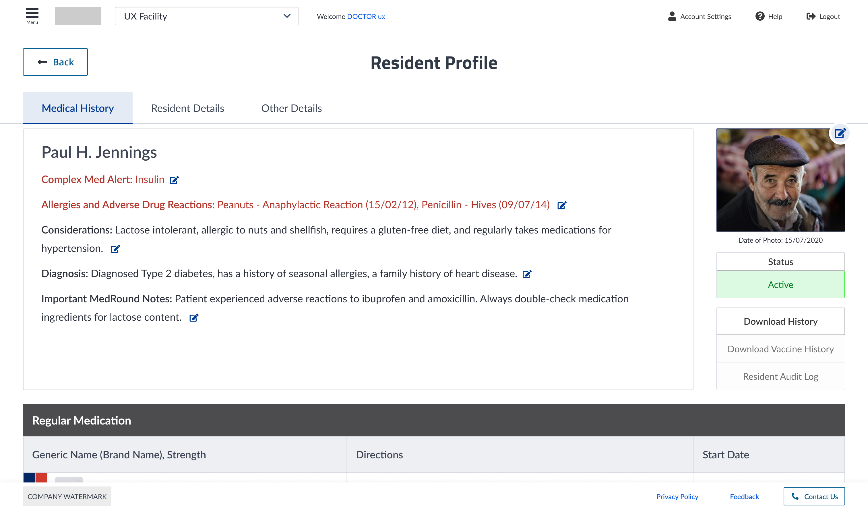
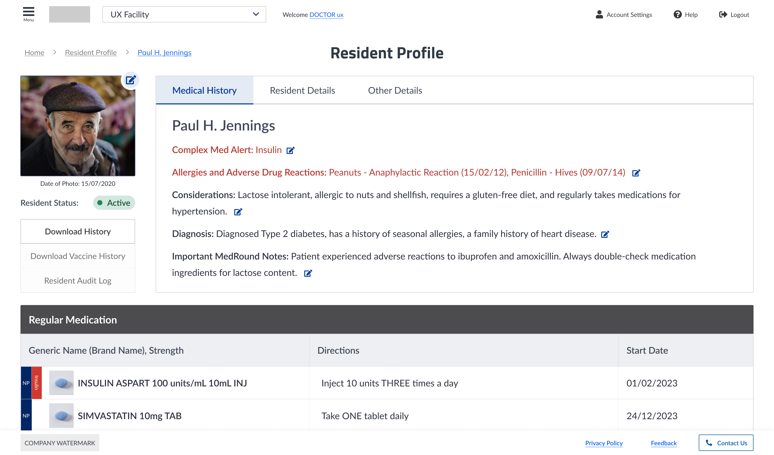
Participants noted that the patient detail pages are clearer and better spaced, making them easier to read. However, some found the pages too busy and cluttered due to their length and the amount of scrolling required to access key medical information. The layout was adjusted to optimise space and provide more information above the fold.
Before
After
✅ WCAG AA compliance achieved across the interface
✅ Complete component library and UI kit shipped and adopted by engineering
✅ Development speed increased — reusable patterns replaced one-off decisions
✅ New staff navigated confidently without extensive onboarding
✅ Support queries routed through proper channels instead of personal numbers
✅ 4-point spacing system set the foundation for mobile (next phase)