
Streamtime
2024
6-months
Design Lead
Scope to what can realistically be built
Retainers are a staple in the creative world, yet Streamtime offered no built-in way to manage them.
Studios patched together workarounds: copying jobs every month, juggling scattered spreadsheets, and often logging hours to the wrong period because every job list blurred together. These headaches were driving customers and leads away.
Our answer was Groups: a way to connect related jobs under one umbrella, track progress toward clear targets, and finally give studios the big-picture visibility they needed.
Before beginning the design process, we first assessed how studios managed retainers and identified their requirements for native support within Streamtime.
We analysed two years of customer support tags, sales call notes, and feature requests. We surveyed over 30 current customers to measure the extent of the challenges and identify common workflows. We then conducted four interviews with studios using different retainer models to understand their specific needs. The interviews informed our architectural decisions. While the survey confirmed the problem was widespread, the conversations revealed significant structural differences in how studios operate.
These methods provided valuable insights that informed our approach to native retainer support and enabled us to confidently define the v1 roadmap, including deliverables and items to defer.
Four opportunities shipped in v1. Two were scoped out — one for technical reasons, one as a deliberate next-release decision. The shipped/deferred split shows the research informing scope, not just feature direction.
From the research, we identified three requirements for the first design sprint as non-negotiable: a parent-level budget and a target view above individual jobs, a period structure for time-based retainers, and a way to link existing jobs without disrupting how they already worked.
What the research couldn't resolve was whether one structure could serve all of it. We found that users had vastly different retainer setups and needs.
Some studios ran time-based retainers; others managed multi-job projects that required a combined view with no recurring cadence. We were left wondering how we might best support a wide range of users' setup flows without overcomplicating the feature.
One group structure would either overcomplicate the workflow or under-serve another group. The research made the case for at least two distinct types before we'd designed a single screen.
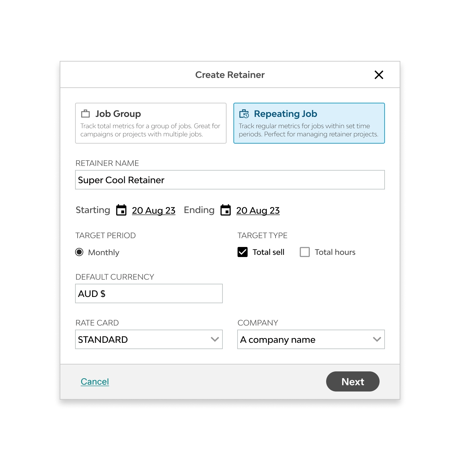
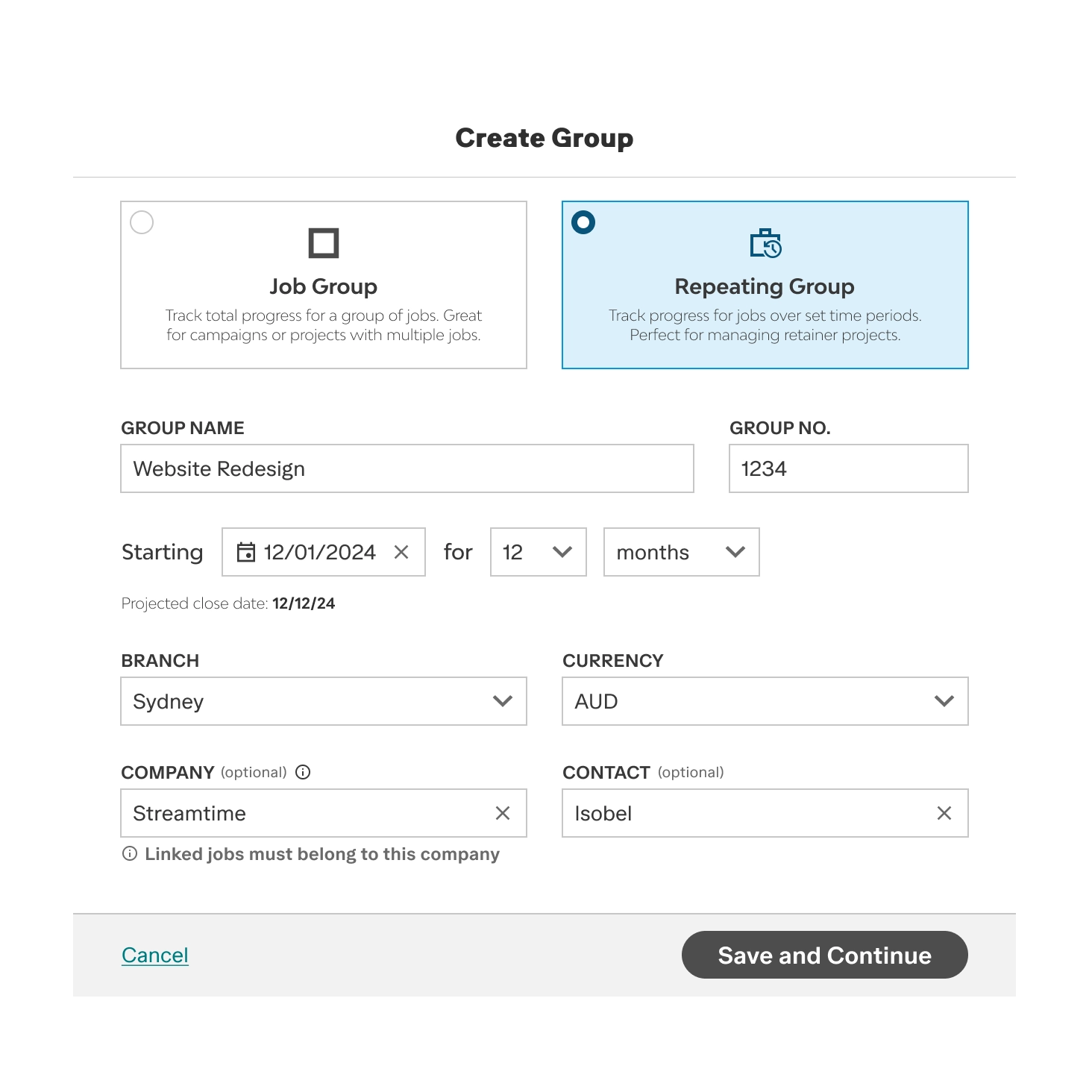
To support the diverse needs and setups of our customers, we committed to two types of Groups. Repeating Groups for periodic retainer work — a start date, number of periods, period length, per-period targets, and a projected close date. Job Groups for flexible multi-job projects — optional dates, no period structure, aggregate metrics across all linked jobs.
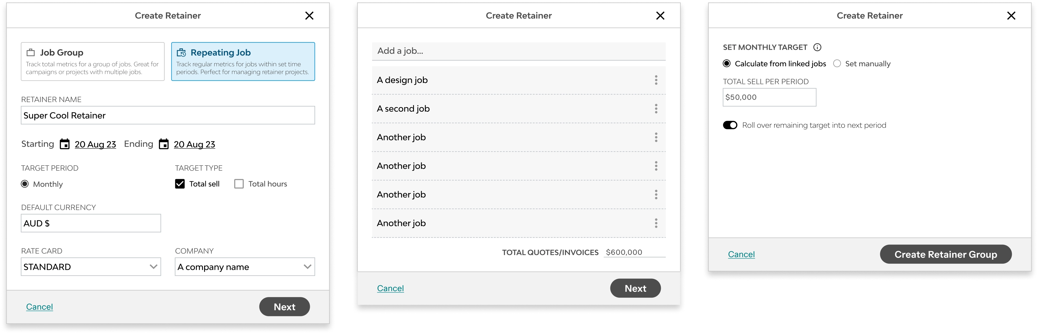
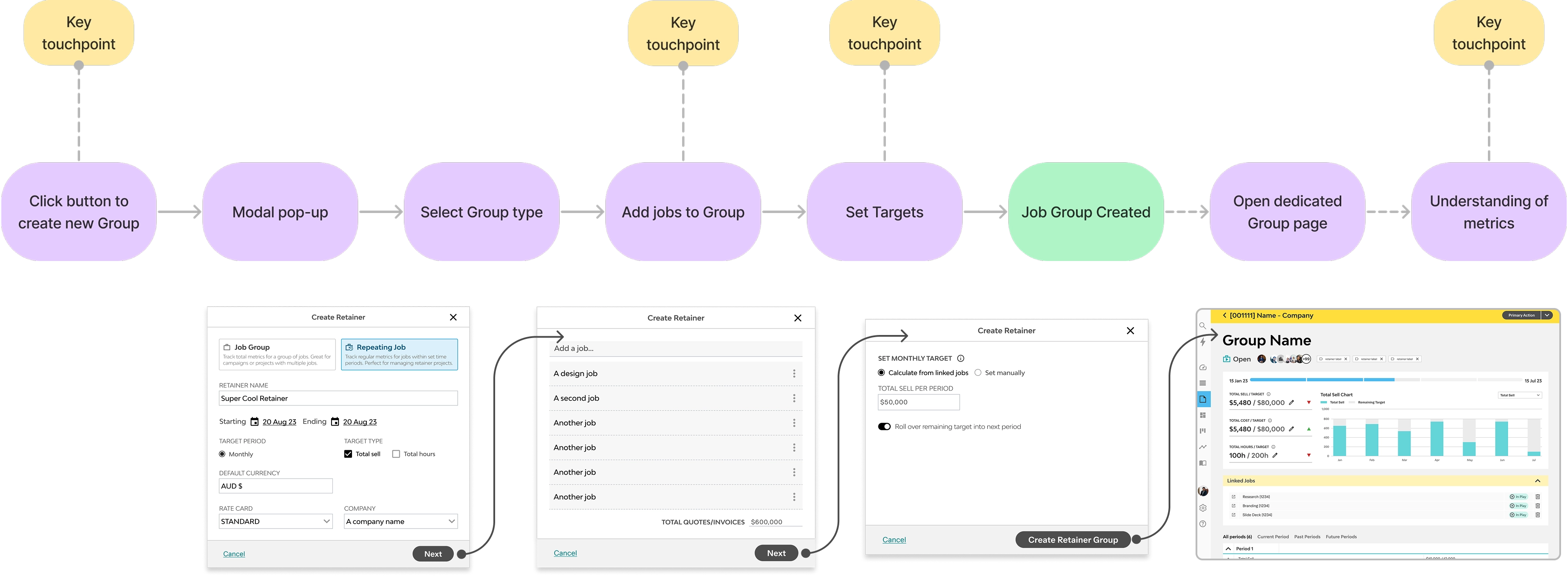
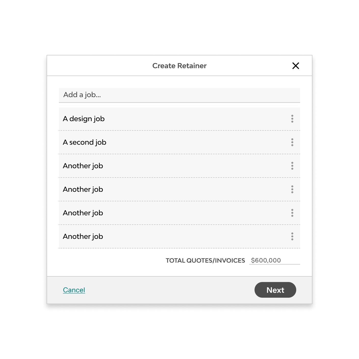
Built into a demo environment, the design was tested against a copy of each customer's account. The setup ran inside a single modal with type, jobs, and targets in one flow, landing on the Group overview page.
We tested the design and user flow with four customers across different retainer models — monthly fixed fee, quarterly hour banks, time-and-materials with rollover, project-based groupings.
The modal flow created a loading problem nobody could interpret. The flow ran: select type → link jobs → set targets. Every job added triggered a backend recalculation and a dismissable full-screen indeterminate loader. Participants waited, assumed the page had broken, or clicked out before it resolved. The loader was doing real work; it read as an error.
The type distinction wasn't clear. Equal visual weight between the two types, not enough to show they were structurally different things.
The empty state disoriented. Landing in a blank overview after the modal read as a mistake, not a starting point.
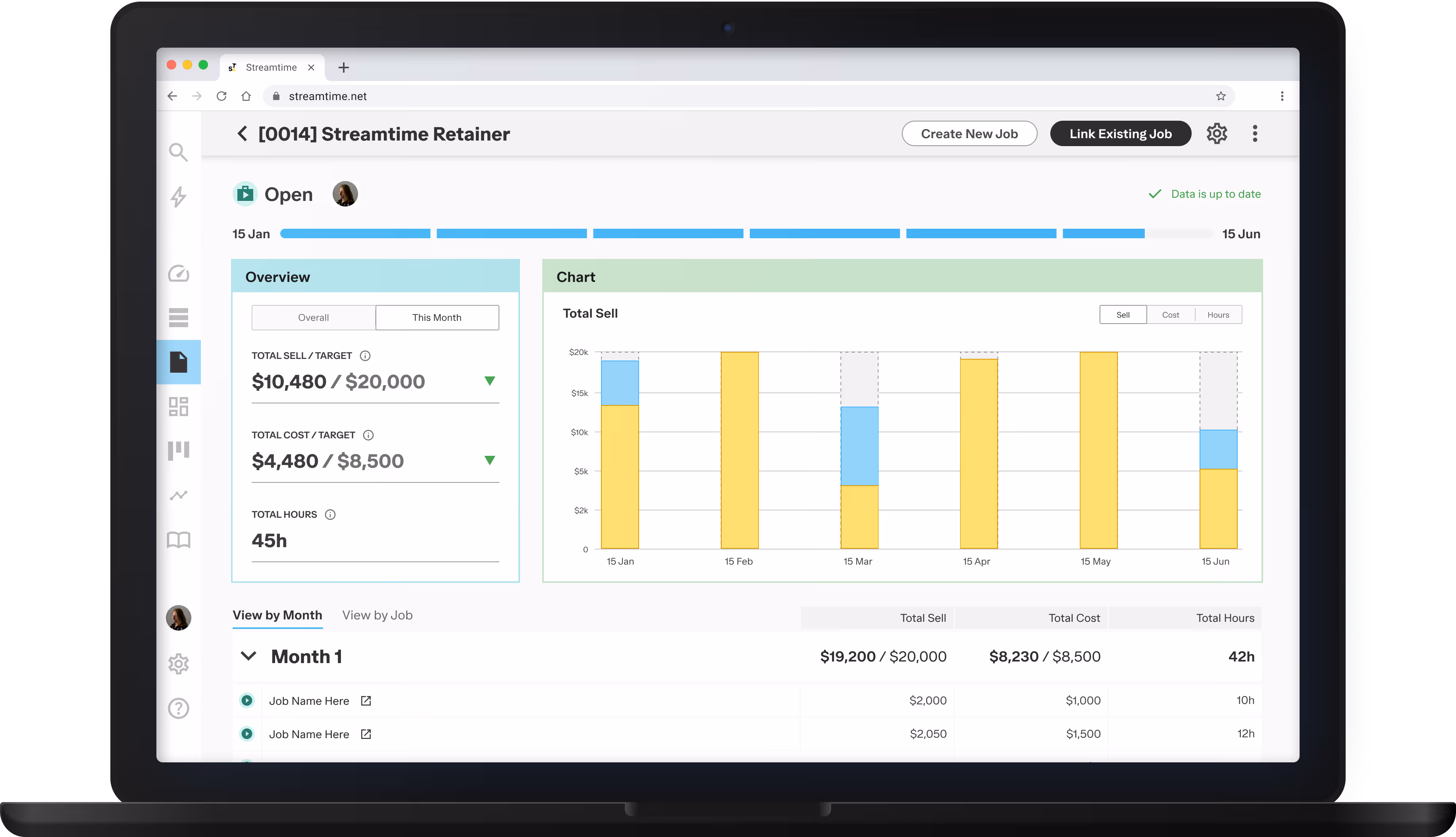
The chart answered the wrong question. The donut showed where users were in the current period. Participants wanted to know where the retainer was tracking overall.
Every participant responded positively when the overview loaded with real data. The concept worked. Getting there didn't. Every change that followed was about the path, not the destination.
Usability testing with customers in their demo environments gave us clear data on what needed to be adjusted prior to release. I made some specific amendments to the design before handing over to developers.
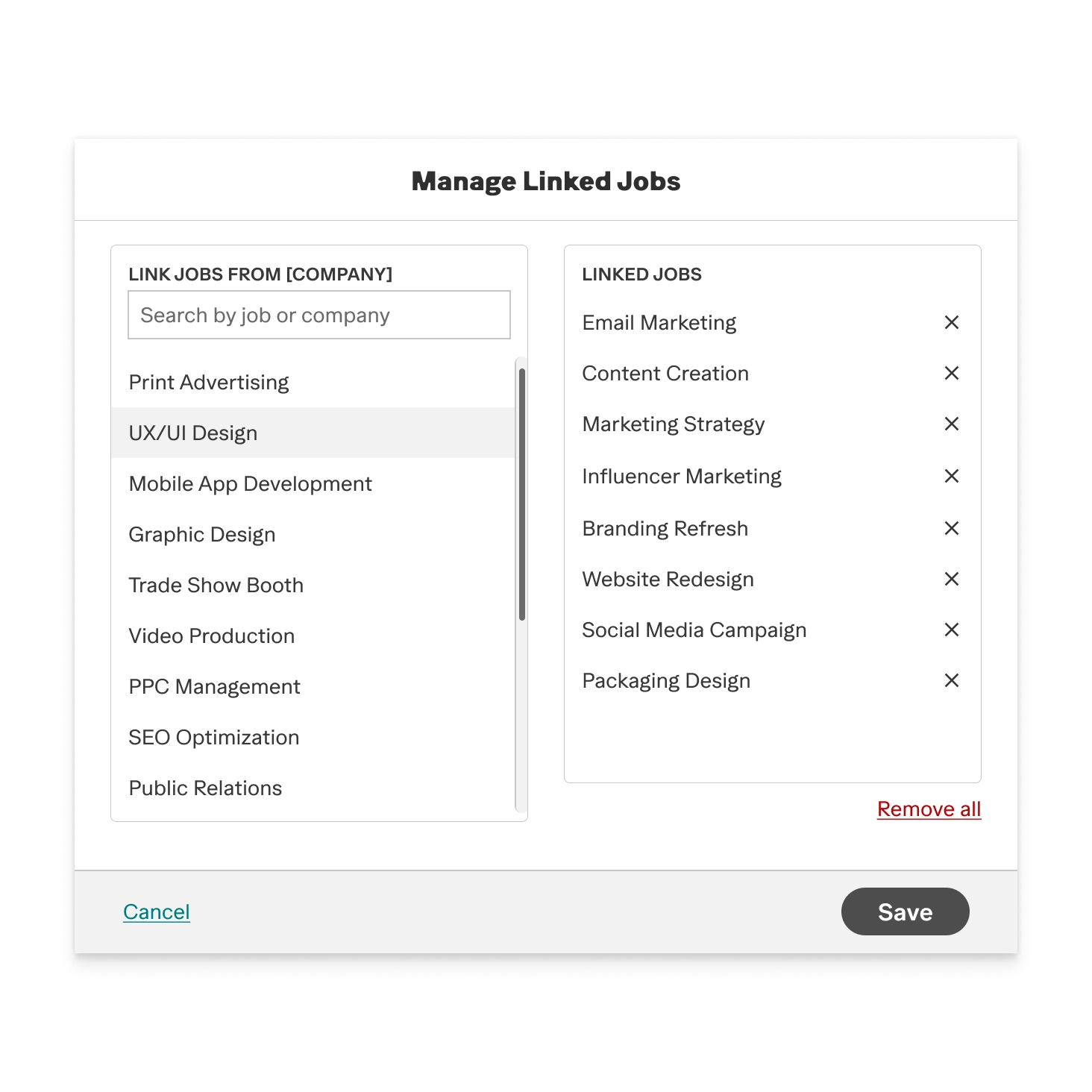
Previously, linking jobs during the creation modal caused backend delays, resulting in users seeing an empty Groups page with a full-page loading state. Removing this step resolved the issue.
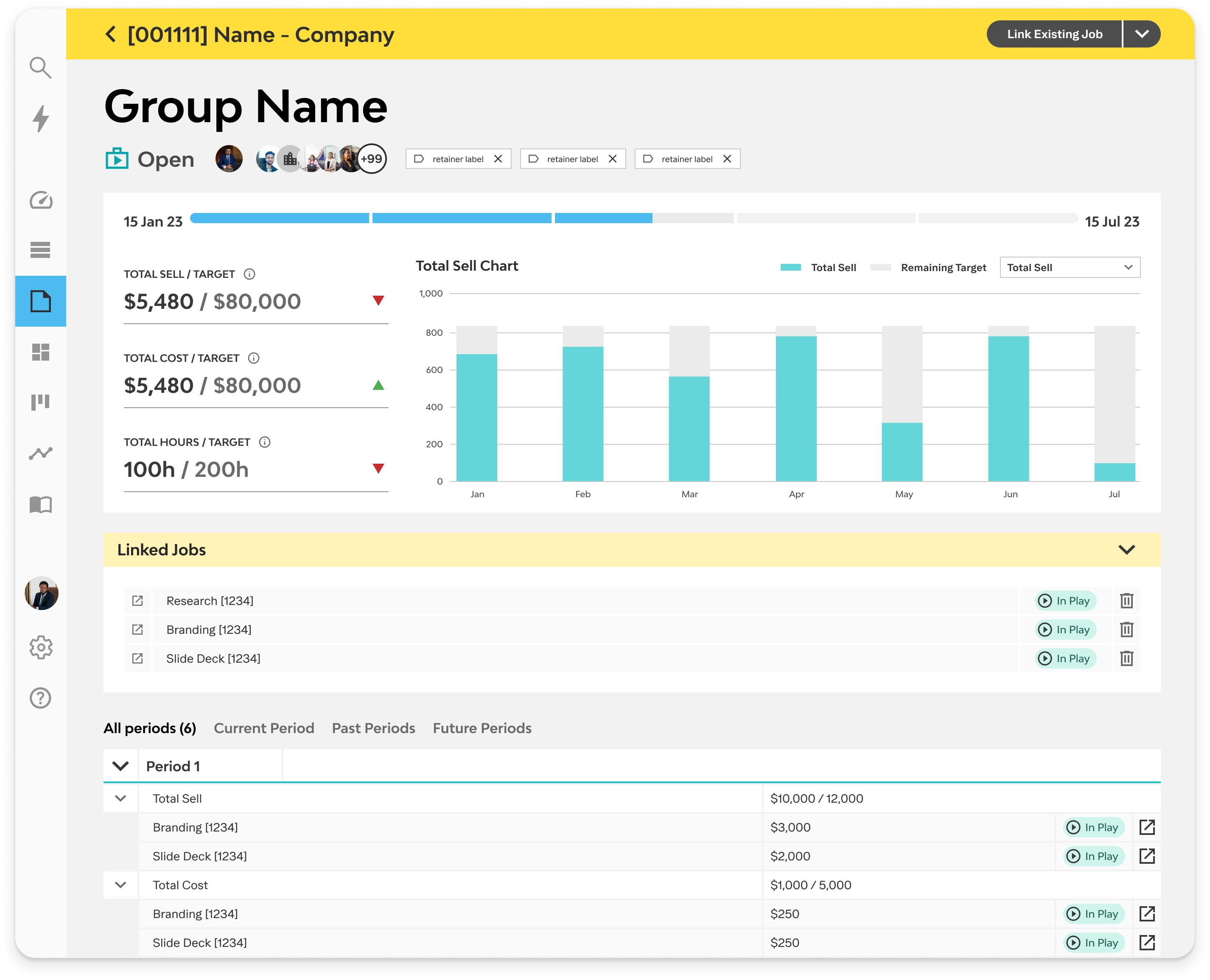
The new flow allows users to select a type, set targets, and then land on the group page, which now prompts job linking from an empty state.
An additional benefit is that studios can pre-build a group before individual jobs exist, which was not possible in the original flow.
Participants didn't read Repeating Groups and Job Groups as structurally different things. Equal visual weight made them look like variants of the same thing.
The redesigned selection step gives each type its own framing, with the structural difference stated up front. Studios now made the choice knowingly.
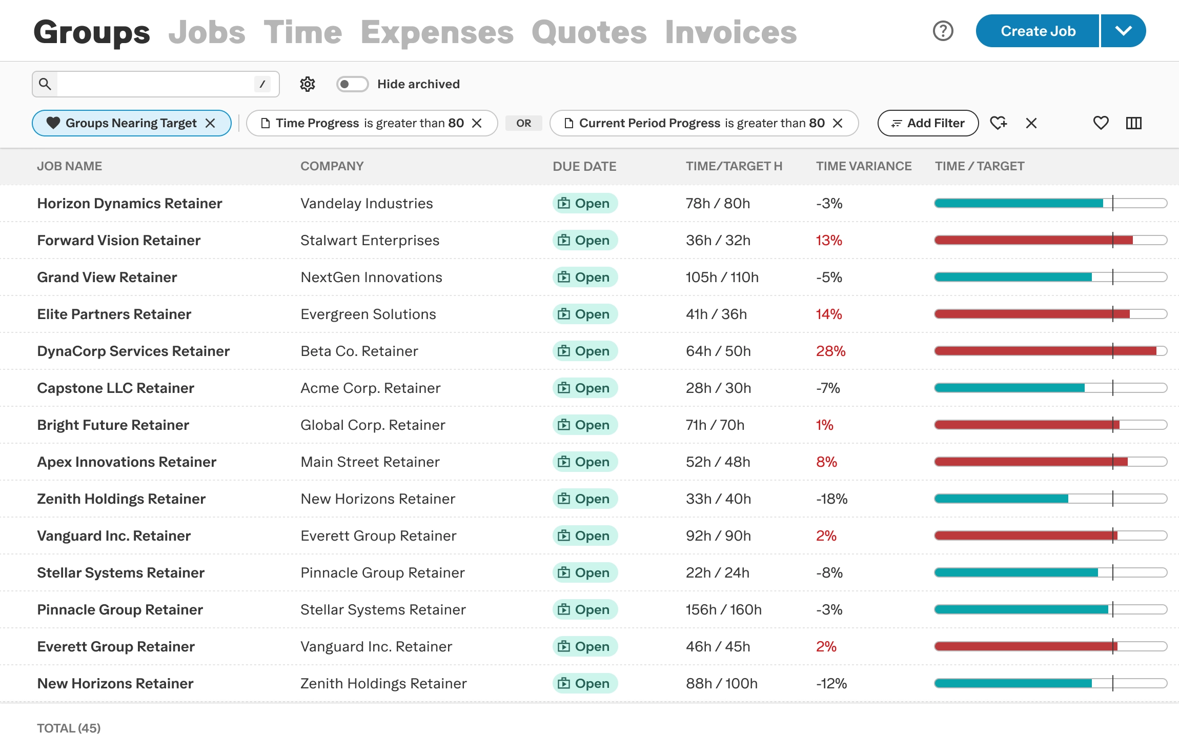
Groups was added as a new entity type in the existing list view, giving studios batch actions, basic reporting, filtering, and easy access to the create flow.
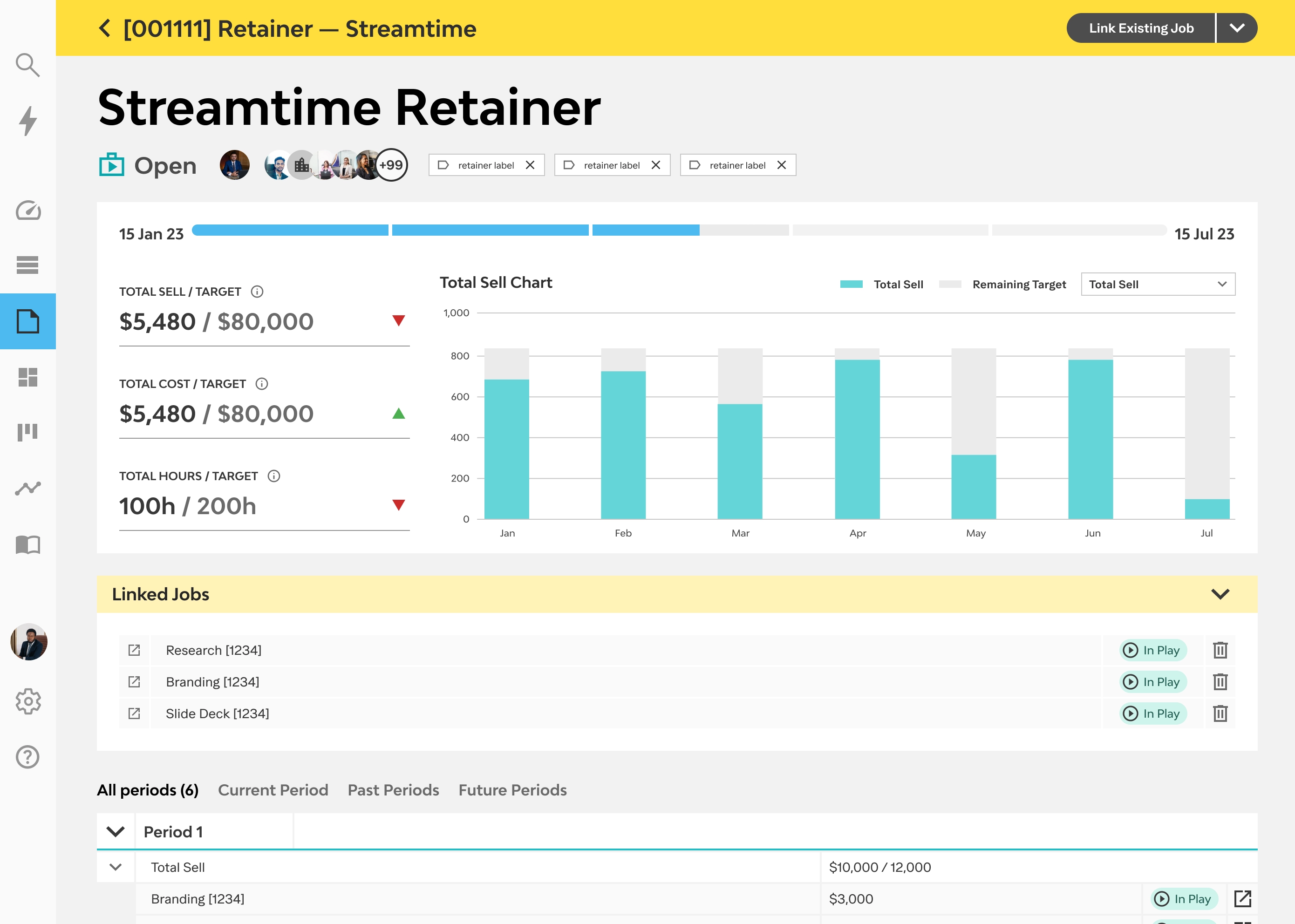
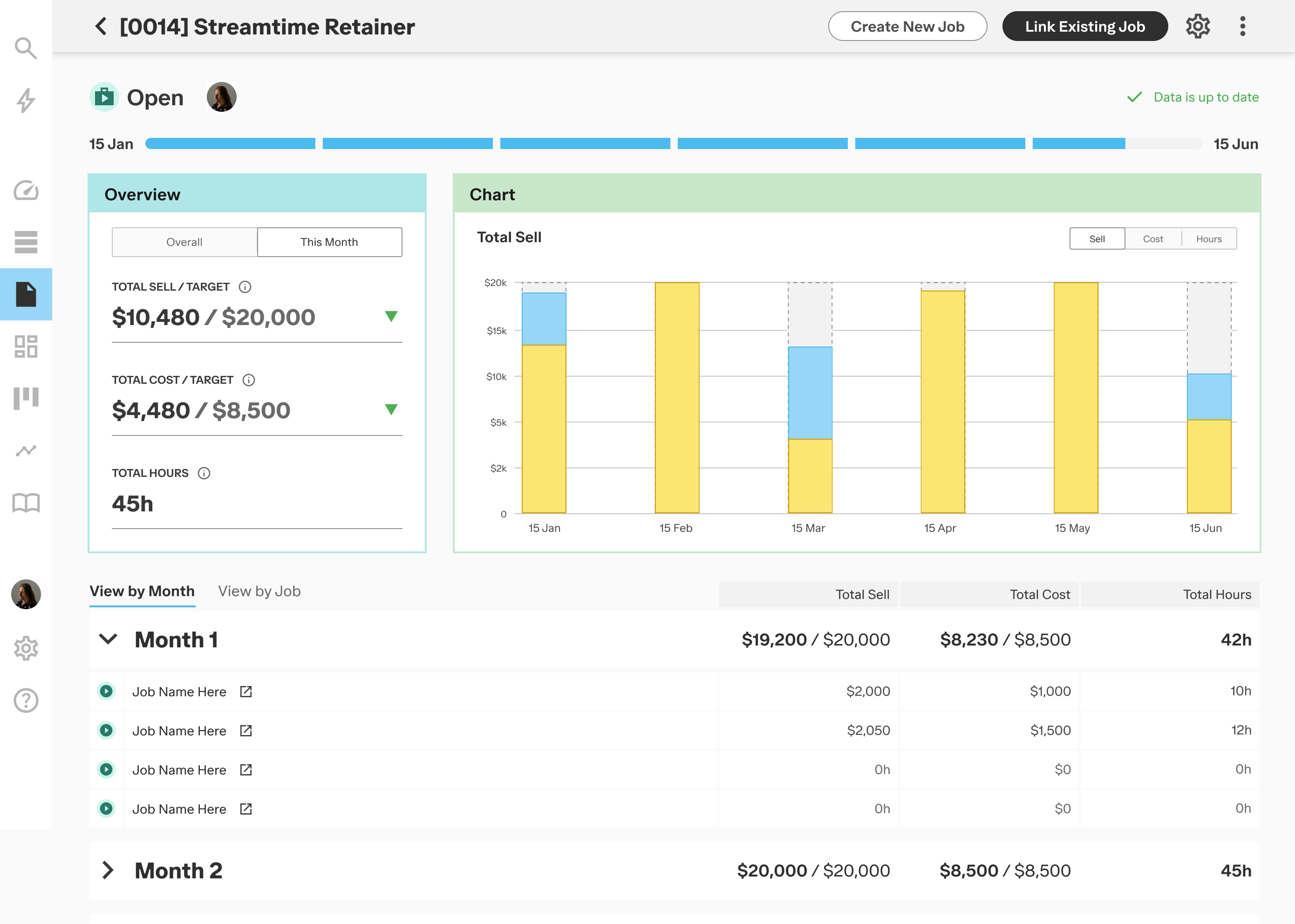
The Overall / This Month toggle allows users to view project progress both cumulatively and for the current period. Linked jobs are now integrated into their respective period structures instead of appearing as separate blocks.
Studios running retainers now have a workflow that's part of the product. Studios running campaigns or multi-job projects without a recurring structure get the same parent-level view without the period overhead.
The two-group architecture was the right call. Research made a strong case for it, and testing confirmed the concept worked.
I underestimated the onboarding burden of target configuration. Choosing between metric types and understanding the difference between caps and goals is the feature's most powerful capability. I treated it as a form with supporting copy when it should have been a guided moment — something that explains the concept before asking users to act on it. Tooltips don't solve mental model gaps. I knew that principle; I didn't apply it here.
The loading state issue was a more fundamental miss. I designed for near-instant data population without aligning with the team on actual processing latency before the pattern was built. An earlier conversation about data latency would have changed the loading design before we built it. That's a lesson about process, not design.

