
Streamtime
2025
12-months
Design Lead
Scope to what can realistically be built
Our Gantt chart hadn't been touched since 2019. In that time, user expectations shifted, competitors raised the bar, and a backlog of pain quietly grew. By the time this project landed, the feature had become a liability: outdated UI, confusing UX, and a codebase affecting performance. Customers were leaving us to manage their timelines elsewhere. My brief was to research it, design it, ship it with engineering, and make sure the launch meant something.
Before using Figma, I reviewed six years of CS-logged feedback and organised it by the most frequent pain points:
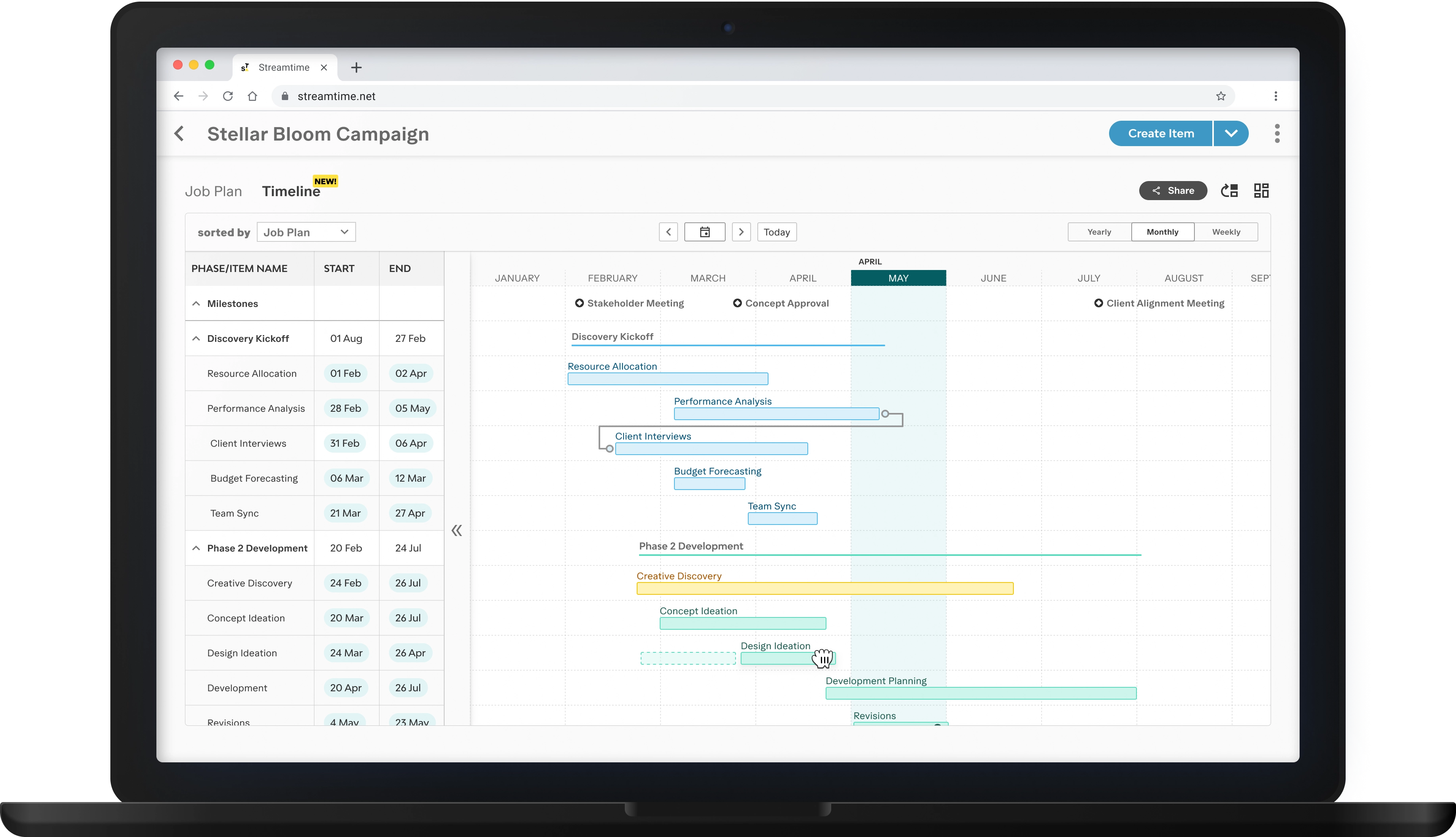
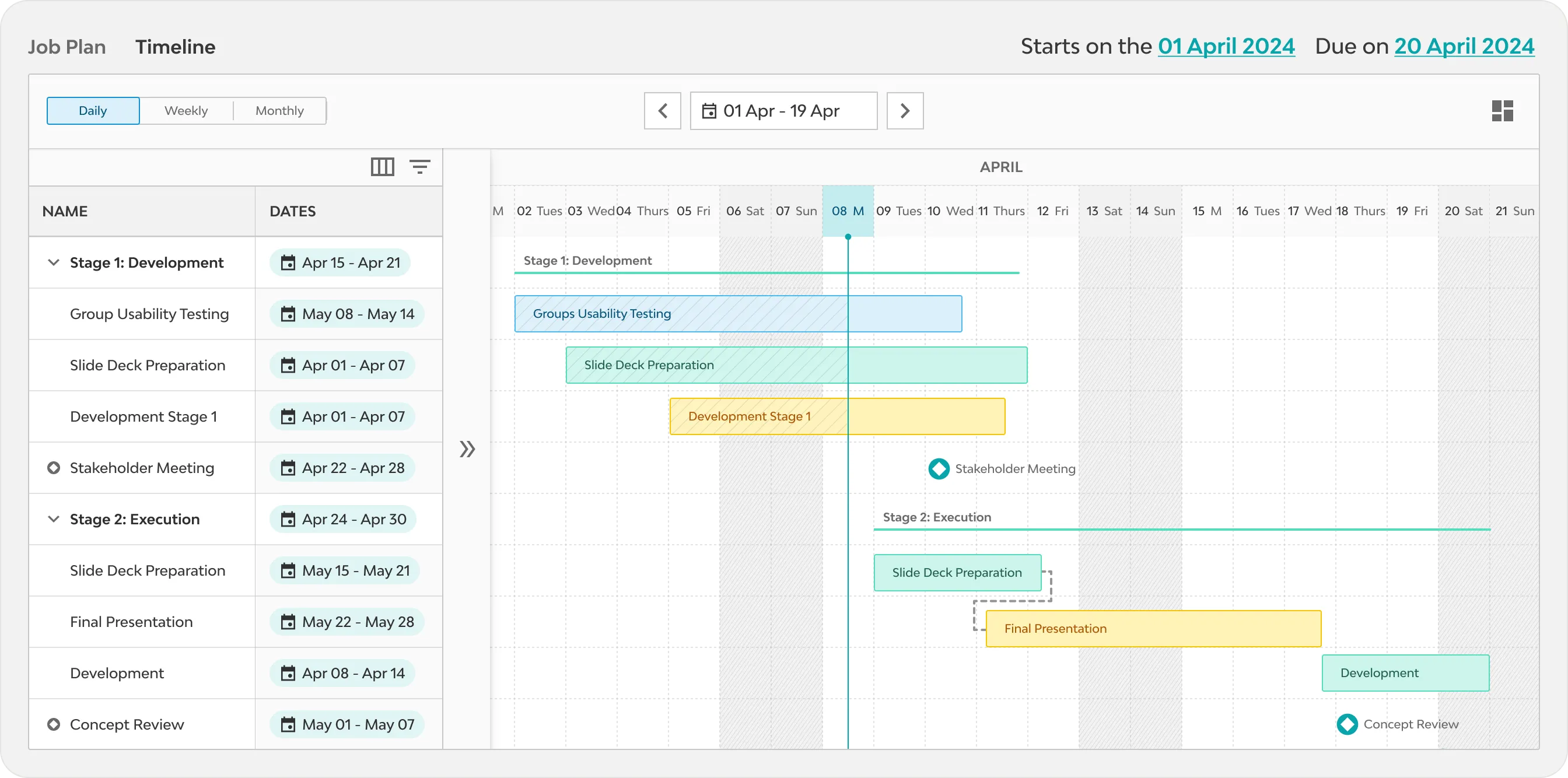
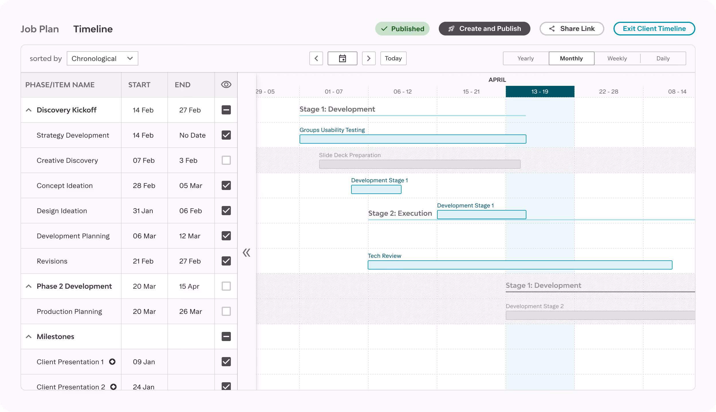
Users needed to navigate between bars and labels to interpret their timelines.
Items could not be added directly in the Gantt chart, so users had to switch frequently to the job plan.
Milestones remained static, so moving an item did not update its associated milestone.
There was no option to share a client-facing version, leading teams to manually recreate timelines in other tools.
Exports were limited to PDF format, despite ongoing requests for CSV support.
The UI pre-dated our design system and lacked accessibility compliance.
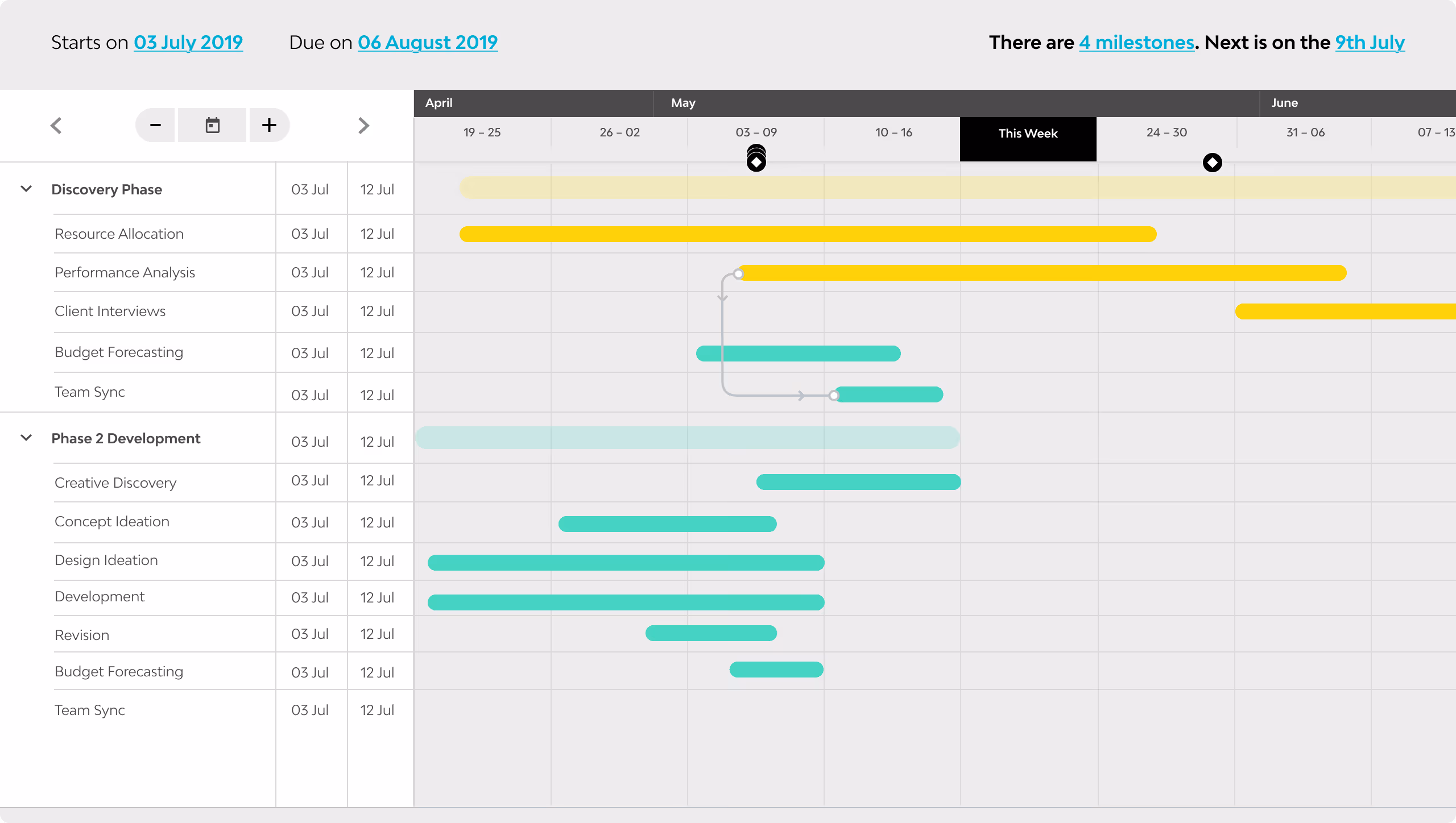
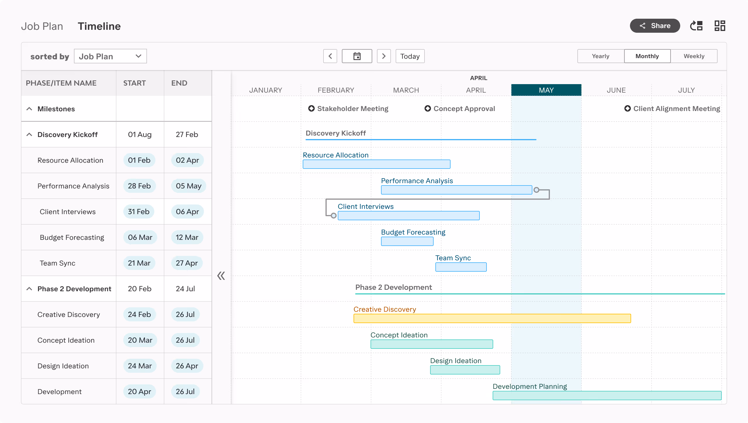
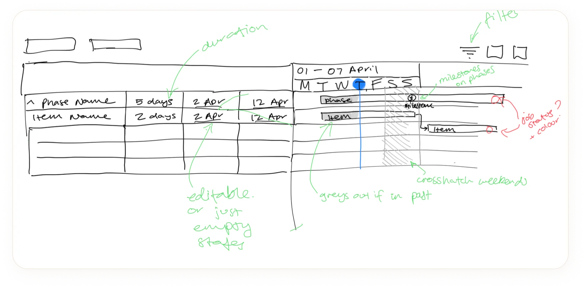
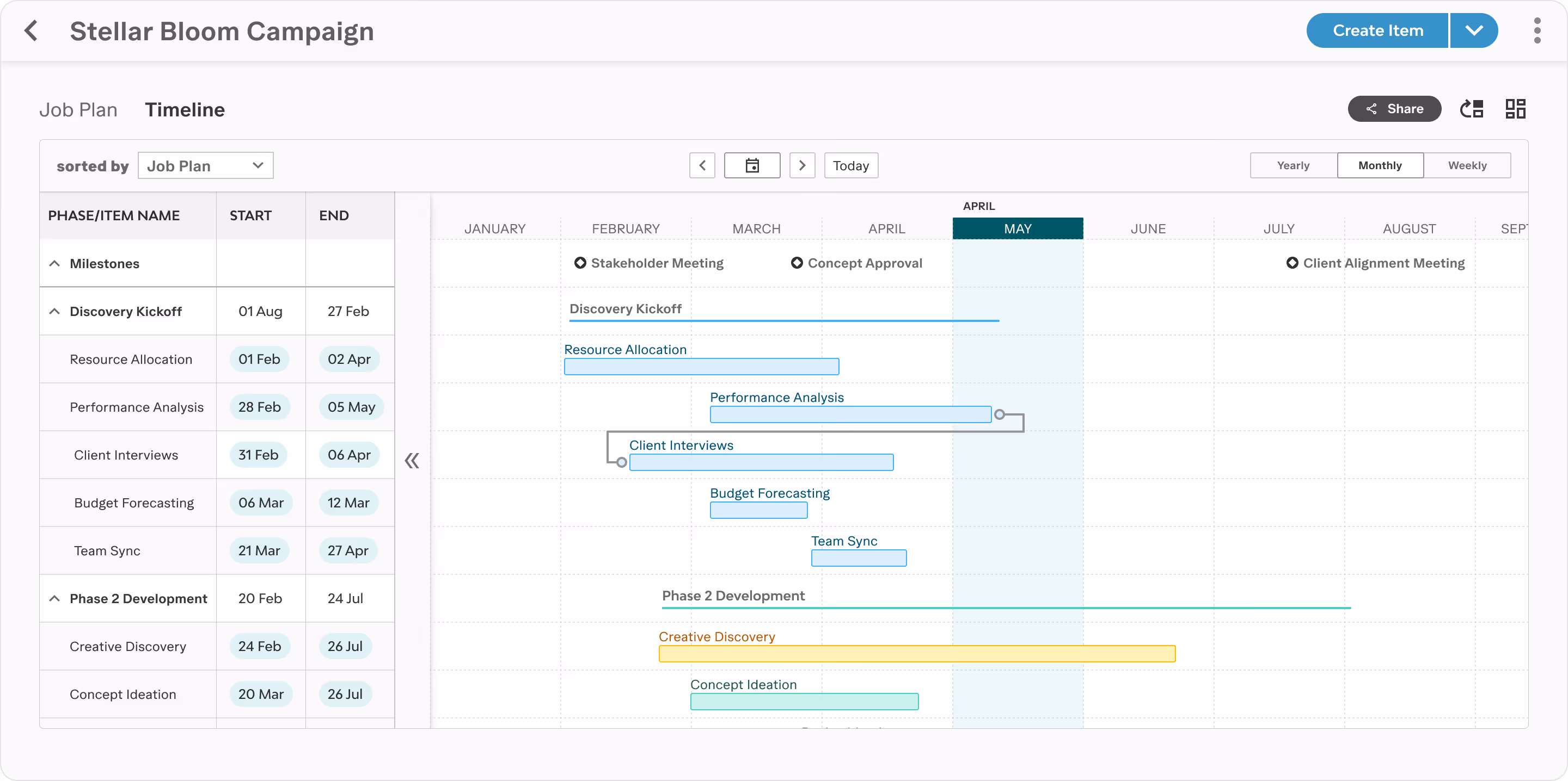
I began with low-fidelity sketches to quickly explore layout options, focusing on label readability, inline editing in the table, and the time switcher. Rapid sketching let me test ideas with engineering before developing high-fidelity designs.
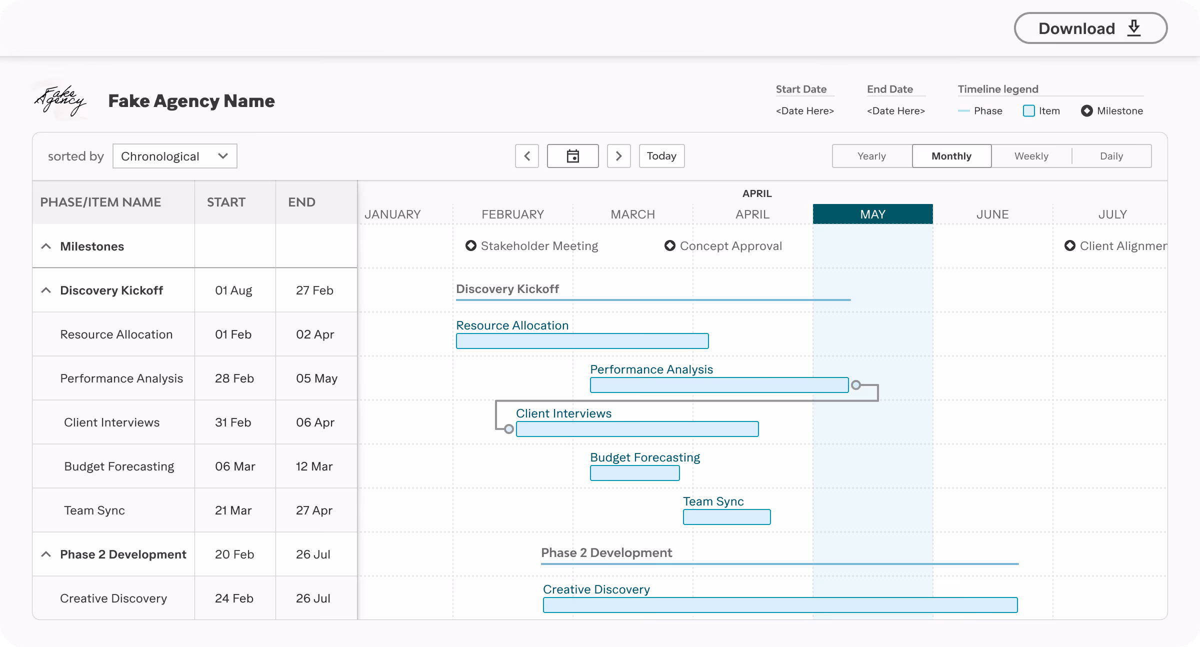
High-fidelity designs were reviewed with the development team, and release timelines, technical constraints, and build complexity guided feature selection. Features were refined, re-scoped, or removed as needed. Once finalised, the design was ready for delivery. Using only our design system tokens and components ensured WCAG compliance from the outset.
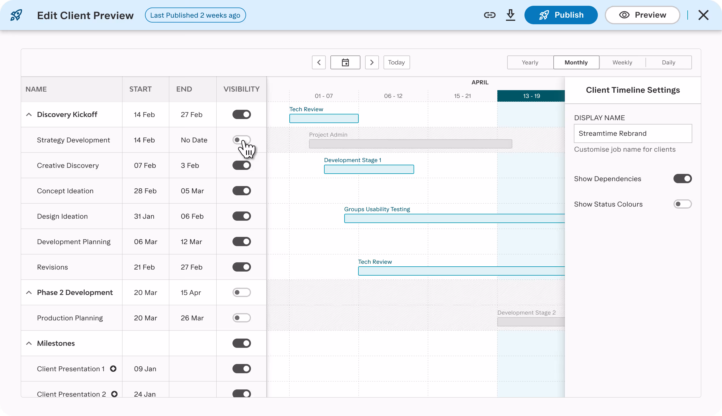
The biggest new feature was the Client View. This new feature allowed users to enter a client edit mode, hide items, phases, or milestones as needed, and publish. Clients then receive an interactive, read-only project timeline that is scrollable and zoomable but not editable. Prior to testing, I suspected the mental model was unclear, but felt a bit stuck on the hows and whys.
We conducted testing in a demo environment with participants' actual account data to ensure realistic feedback. Our primary focus was the Client View.
Users were unable to distinguish between modes. Several edited the client version, believing it was their main timeline and not realizing they had switched modes.
A publish modal appeared immediately upon entering client edit mode, creating a dead-end. This occurred before users were ready to publish and left them disoriented about their location in the workflow.
All other aspects were well received. Aside from the mental model issue, the redesign received consistent praise, with the addition of an interactive client timeline being particularly positive.
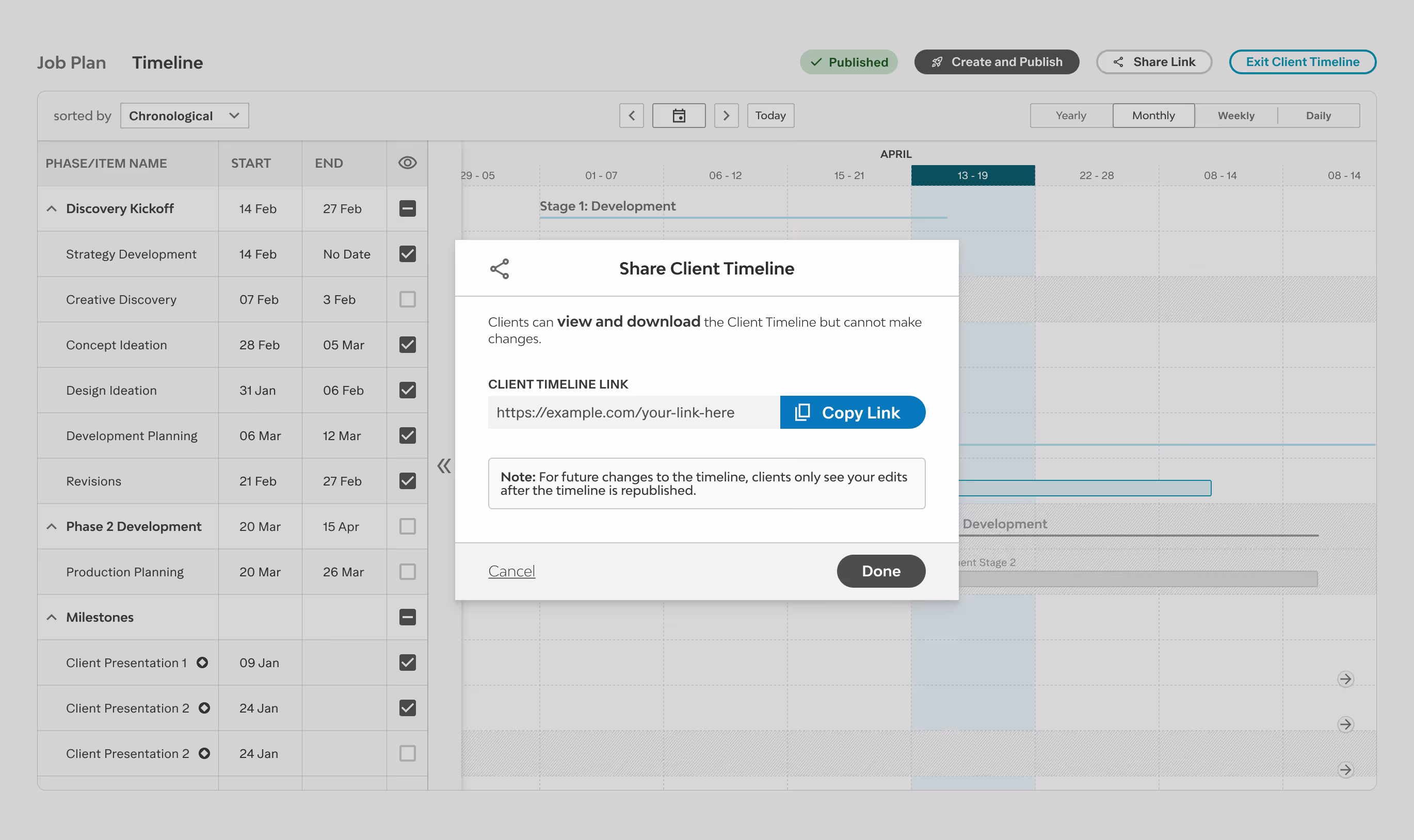
Entering Client Edit Mode triggered an immediate publish modal.
Users followed the generated link, lost context, and returned to edit mode, believing they were back in their internal timeline. The mode switch had become invisible.
The fix was targeted, not a redesign:
Before
After
Removed the publish modal on entry, users now arrive in client edit mode without an interrupting overlay
Added strong visual distinction between internal and client edit modes, always clear which version you're in
Rewrote the microcopy throughout the flow, more explicit about internal vs client-facing states
Given the significance of this feature, I helped organise a formal launch rather than a silent deployment. I produced a two-minute promotional video in After Effects, participated in a webinar to walkthrough the redesign, and featured in a blog post Q&A session with the lead developer where we chatted through the project.
These efforts created valuable re-engagement opportunities with both current and inactive users, which a simple production release would not have achieved.
Click here to read →
Feedback is still coming in, but the signals are strong. Customers who had moved to other tools specifically for Gantt management are returning. Customer Success has been running retraining sessions at scale. Qualitative feedback across channels have been positive so far!
If we had tested the Client View earlier, during the lo-fi stage, we might have noticed the mental model issue sooner. Now, I always add mode-switching flows to my early testing checklist. Next time, I’ll also document the tech review process more clearly as a design artefact. With so many conversations happening, it was easy to lose track of decisions, which made it hard to backtrack or give others outside the main project group a clear decision log.

