I didn't build the system for a rebrand, and that's why it worked.
In Oct 2026, every main screen in Streamtime switched to the new brand at once. It was only possible because of a design system I'd spent two and a half years building.
01 Launch day
The whole product, one release
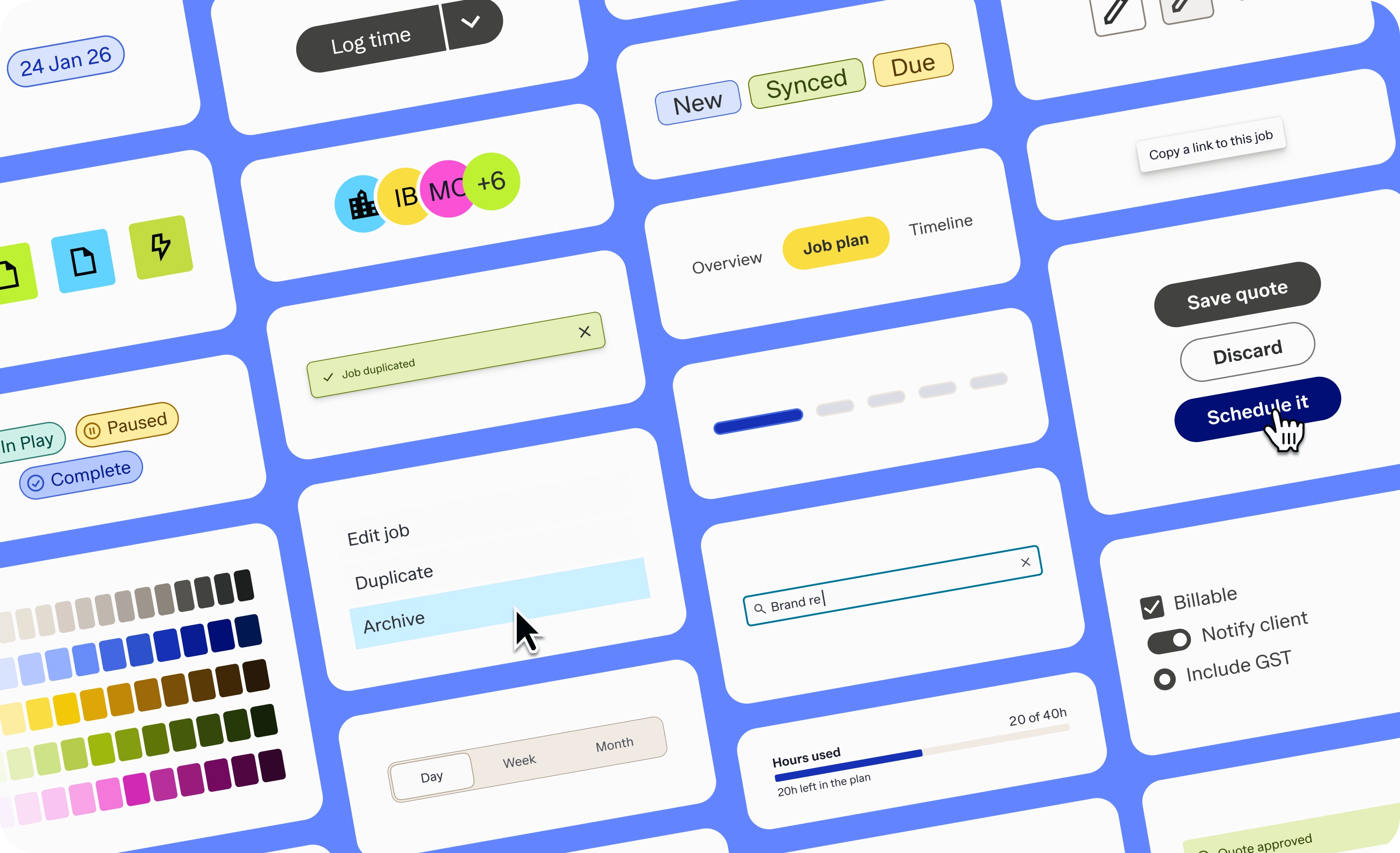
On 23 Oct 2026, Streamtime's new brand went live across the product, alongside a new To Do page. Every main feature switched at once, from the nav to the job tables, so customers never saw half the product in the old brand. It went to sandbox three days earlier for a final check.
The rebrand was one release. The system behind it took two and a half years.
02 Rewind to 2024
A style guide, not a system
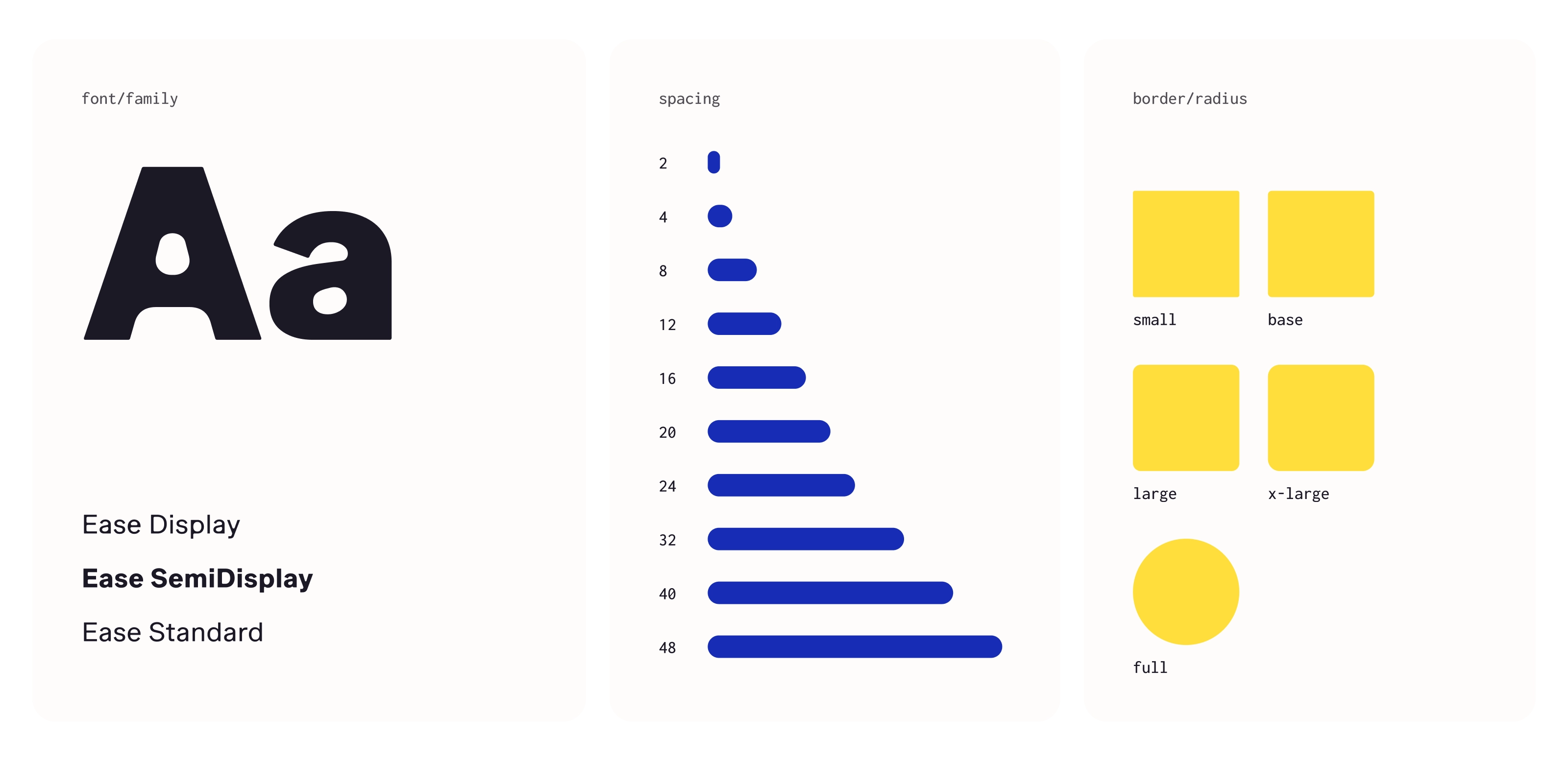
In my first week I asked why our spacing was 2, 3, 8, 10, 20, 30, 40 and 80px. The values had grown with the product across three codebases, and the style guide wasn't connected to any of them.
I was hired to rebuild the system alongside a full refactor of the frontend. The goal was a system that matched the new code, not a new look.
The aim: make the design system the source of truth.
- Moved everything onto an 8-point grid, with auto layout throughout.
- Built most components myself, with every state, focus ring and option set up as variants and properties.
- Matched every component's size and behaviour to the live product and code.
- Built on React Aria, so keyboard and screen reader support came built in. I added helper text, error and success states on top.
- Designed every colour, and logged each change in a dated changelog.
03 The brand arrived
Turning a marketing brand into a working interface
The company rebrand kicked off in Jan 2025 with a brand agency. My job was to bring it into the product.
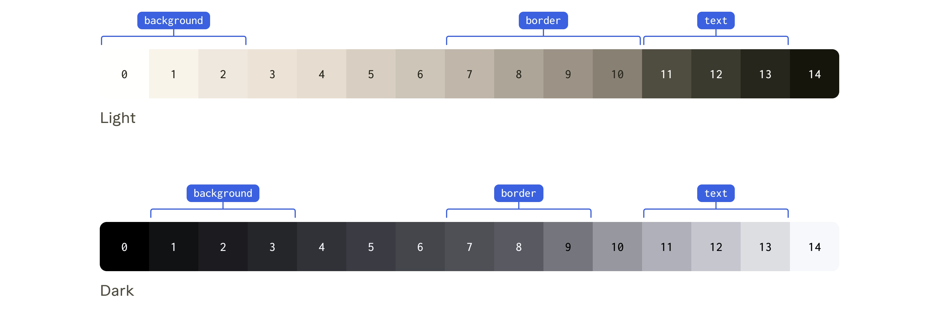
A brand palette is built for marketing. To run an interface, it needs a working layer underneath: steady colours for controls, enough contrast for hierarchy, and accessible pairs everywhere.
In a product, colour is how people find the path that matters most. So I built the product palette from the brand.
04 The token layer
Every colour has two names
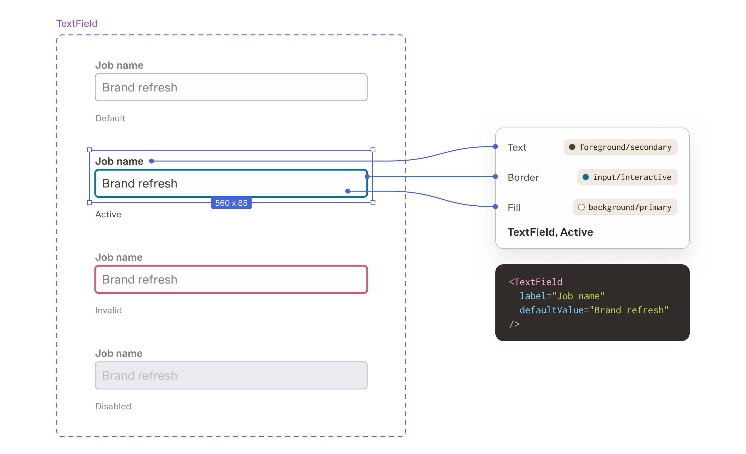
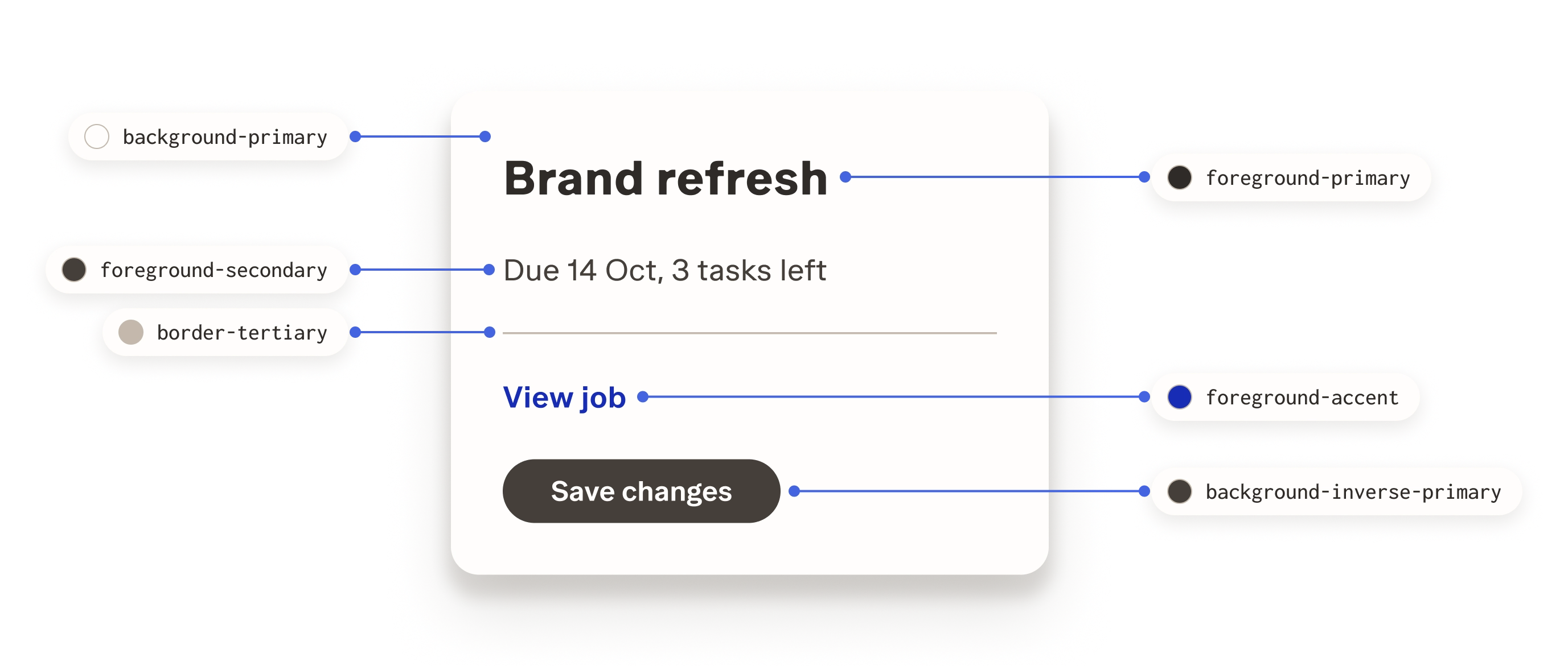
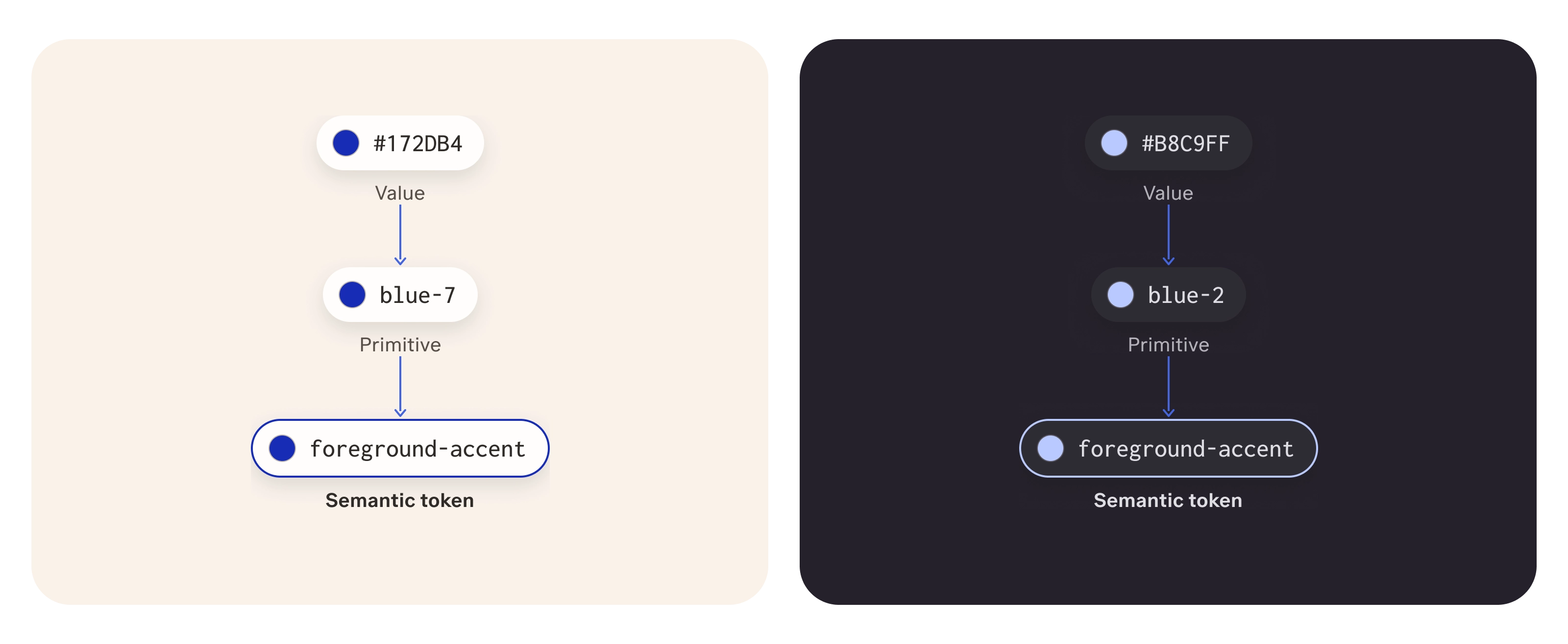
Every colour has two names: what it is, and what it's for. A raw red is a primitive. "The border of an input" is a semantic token.
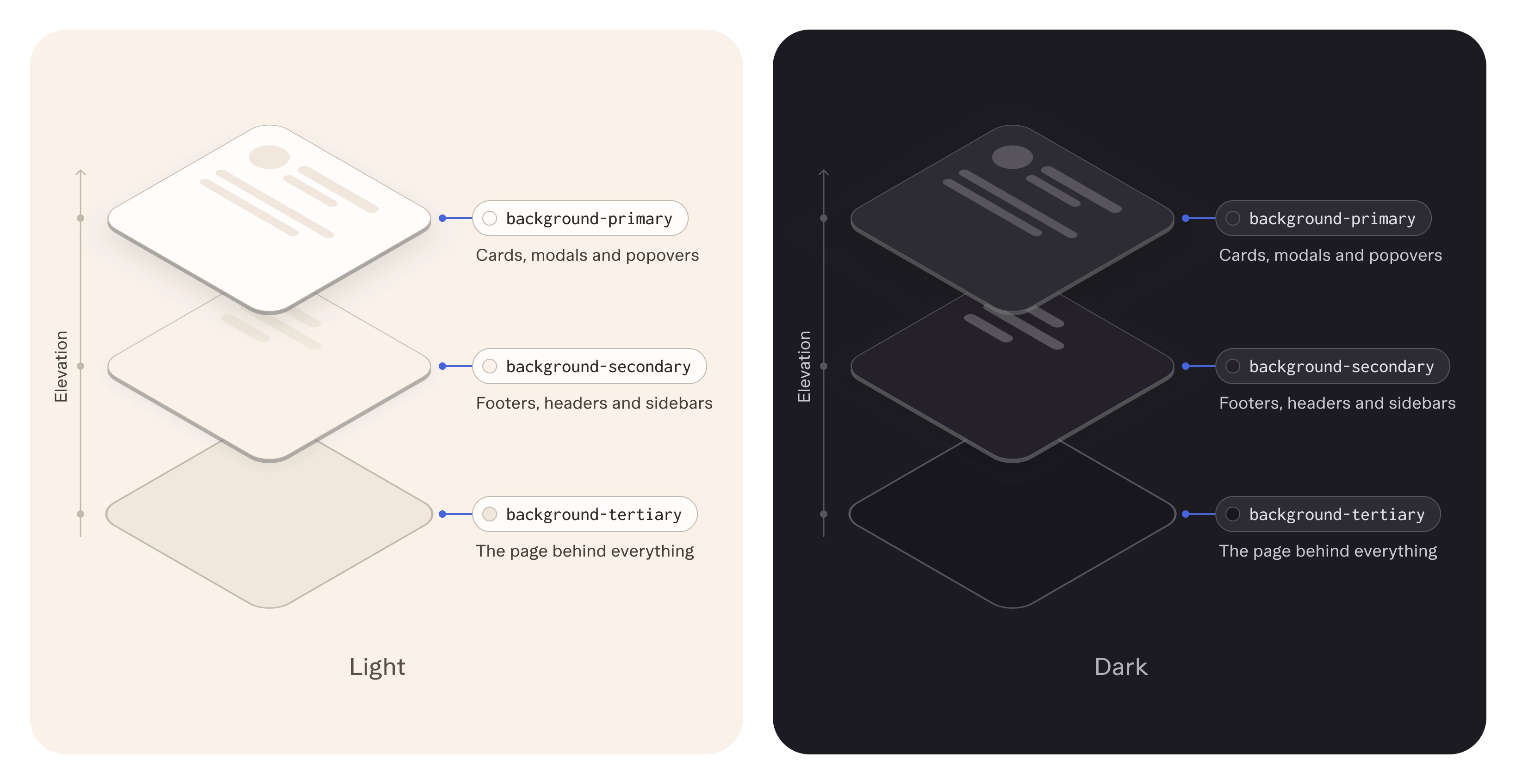
I made the primitive ramps and most of the semantic tokens, with help from my design manager. Every semantic token also has a dark value.
Every text colour passes contrast on every background. Every interface border does too. Accessibility lives in the colours themselves.
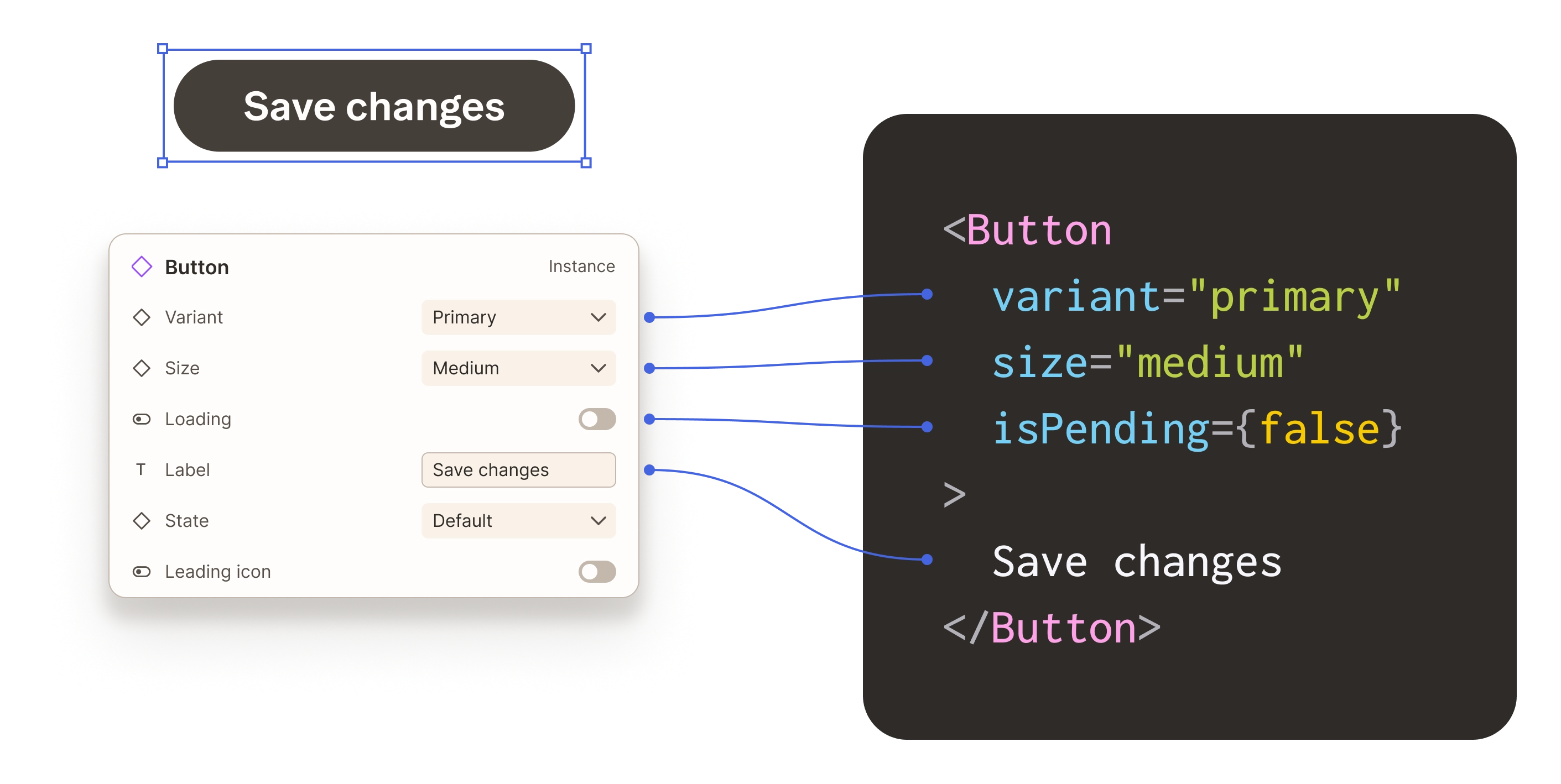
Our frontend engineers set up Code Connect, which links each Figma component to the real one in code. That link is what lets me work in the code too.
I wrote all the documentation, then audited every colour pair. Here are three of the fixes.
Empty inputs and dependency lines were too faint
Interface borders need 3:1 contrast (WCAG 1.4.11), and these didn't reach it.
- Moved border tokens to the lightest step that still passes 3:1.
- Kept dividers deliberately light, and documented which border goes where.
The old teal clashed with the warm brand
The In Play status still needed teal, kept distinct from success green.
- Replaced it with a softer Sea glass ramp.
The date chip shouted, even when empty
Its bold style was too strong for most of the places it appears.
- Gave it a quieter dashed empty state, and moved the bold style to an Emphasised option.
One hover state is a deliberate exception at 2.42:1. Fixing it would make it identical to selected, so I kept the distinction and documented why.
05 The switch
Page by page, then all at once
The brief was simple: click through the nav, and every main feature should look on brand.
Components rolled out page by page, as each part of the frontend was refactored. Colour was different. My design manager and I chose to switch every token in one release.
The risk was a rough first day. So we tested in sandbox first, and kept a way to revert the To Do page.
I rebranded most of the tokens and components, and many of the pages: the nav, To Do, Personal Dashboard, Availability modal, Timeline and the job tables. My design manager took on specific pages. I also brought 103 icons into one set.
Legacy areas like the Schedule and Reporting couldn't be rebuilt quickly. Engineering mapped each old colour value to a new one, using heat map tokens I designed.
06 What it unlocked
From handoff to shipping
I built the system so the look could change in one place. It ended up changing who can change it.
Because every Figma component maps to a real one in code, I don't stop at handoff. I run the product locally, make changes with Claude using our own components and tokens, and push pull requests for engineering to review. Token changes go in the same way, so nothing is exported or retyped.
In the final week before launch, that's how I polished the To Do page and built the Timeline sharing walkthrough.
The design system isn't something I hand over any more. It's something I ship with.
Next up is dark mode, already in every token.