Modernising medication management without breaking workflows
How a design system made an aged care medication system WCAG AA compliant, without changing the workflows nurses rely on. Client details are anonymised.
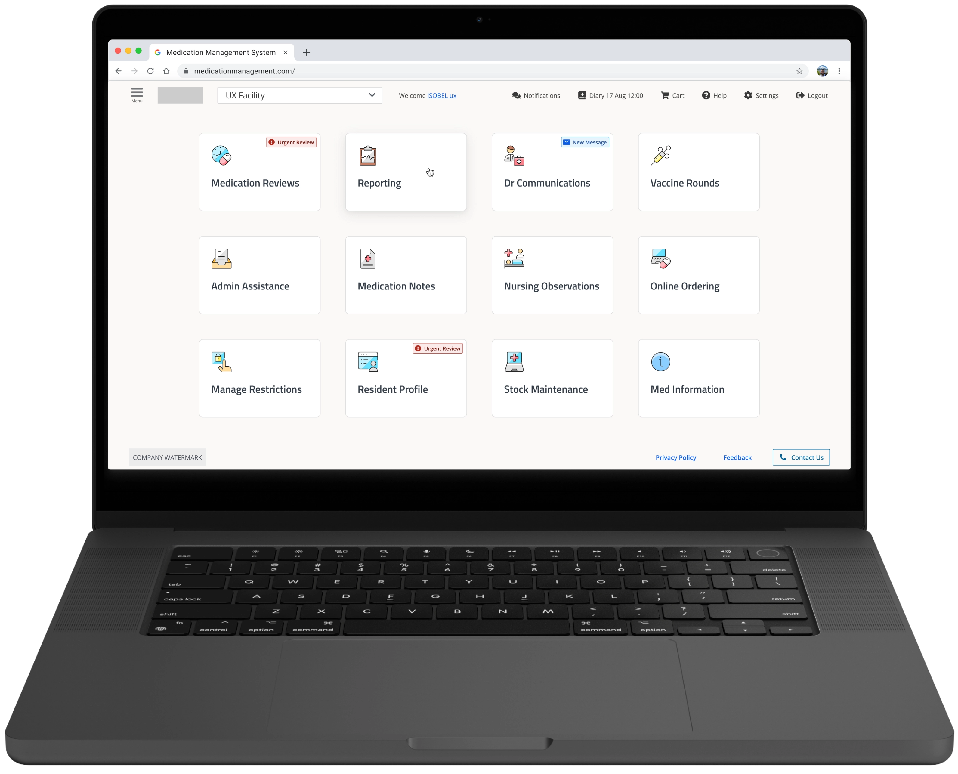
01 Background
When a confusing interface becomes a safety risk
Nurses using a Sydney-based medication management system faced low contrast, unclear icons and a help feature so hard to reach that staff called Customer Support on their personal phones.
The brief: modernise the interface without changing anything critical to daily use, because disrupting medication workflows is a patient safety risk.
What we heard
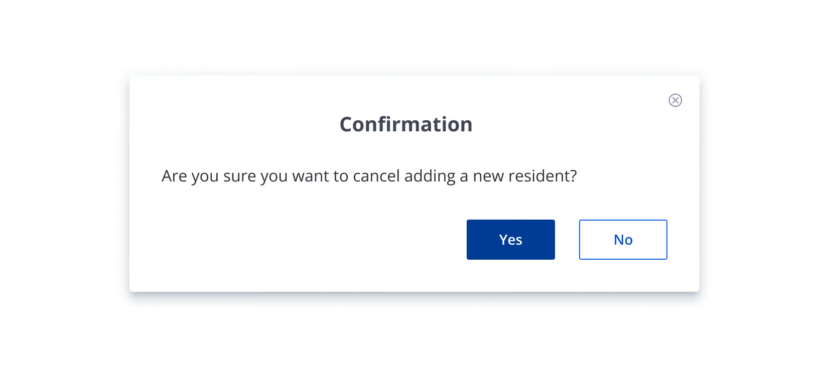
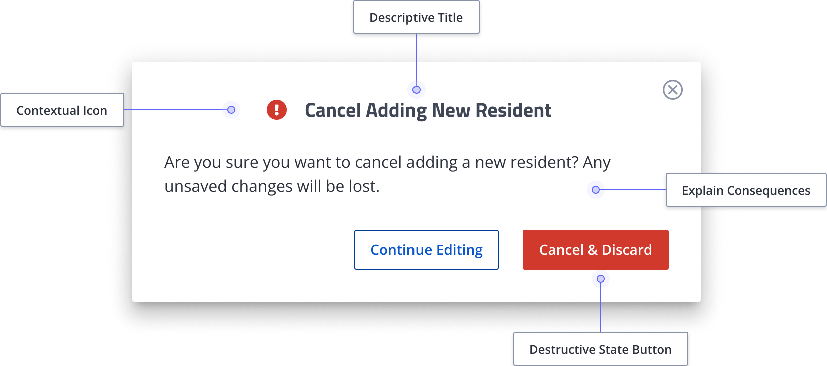
One doctor lost work mid-consultation, because a confirmation modal only said “Yes” and “No”.
02 Research
Talking to the people who live in this interface
I ran 30 semi-structured interviews with nurses, prescribers, pharmacists and support staff, plus a UI audit of contrast, colour-blind accessibility, icons and mobile. The same issues came up across every role:
- Icons were unclear and inconsistent, and some had a gender bias, so staff relied on text and routine instead.
- Text was too small and too cramped for bright wards and staff who wear glasses.
- Colour-coded alerts were invisible to colour-blind staff.
- Help was hard to find, and prescribers moving between patients had no mobile experience.
03 Design system
Building the foundation before touching a screen
Years of engineering-led decisions had left no shared standards, documentation or single source of truth. Every inconsistency on screen came back to that.
So I audited every screen, then built a type scale, a 4-point spacing scale, a WCAG AA colour palette, and a responsive Figma component library with every interaction state.
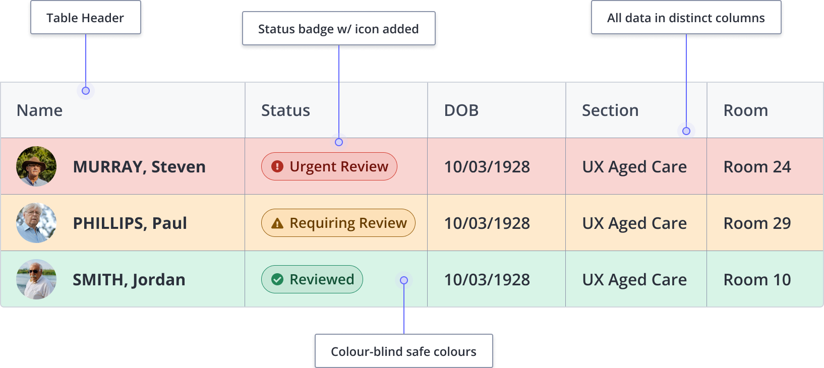
If removing colour compromises meaning, the design is incomplete. Every alert state now pairs colour with an icon and a text label, so colour-blind staff no longer miss critical alerts.

04 Testing
What testing showed me
I tested the redesign with staff at different experience levels. Newer staff found the new homepage clearer, while experienced staff noticed more issues and were more resistant to change.
Dose round table cells felt too small
Easier to read overall, but a concern for staff who wear glasses.
- Increased the cell size.
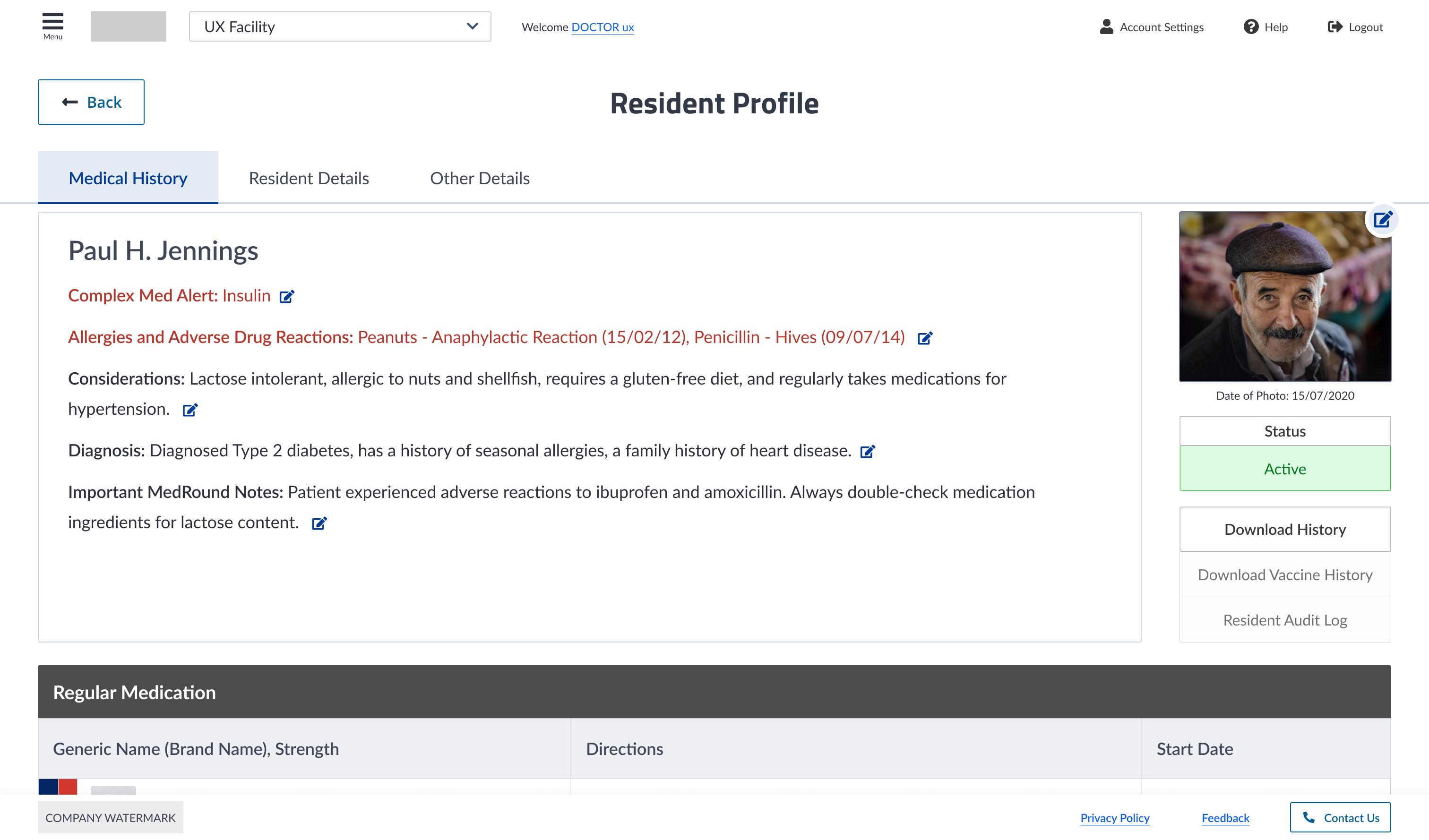
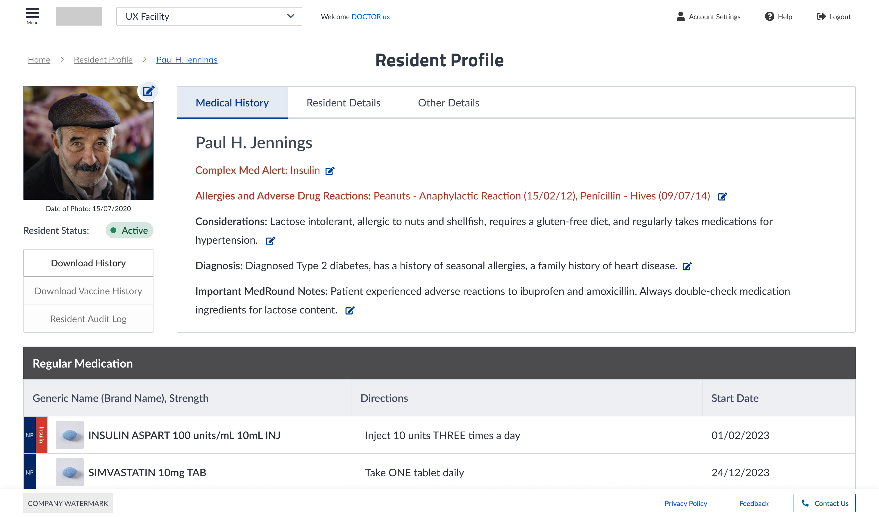
Patient detail pages felt too busy
Clearer and better spaced, but too much scrolling to reach key medical information.
- Reworked the layout to fit more information above the fold.
05 Outcome
What the redesign delivered
Engineering adopted the component library and UI kit, and reusable patterns replaced one-off decisions, so development sped up. New staff found their way without extensive onboarding, and support queries moved to proper channels instead of personal phones.

